Confined Space Infographic
Abfad Rescue are specialists in industrial rescue and access solutions. The brand is positioned as a trusted authority on confined space safety, with a mission to save lives through rescue team provision, and awareness of the dangers.
A clear, engaging, and professional infographic was needed for a campaign to educate workers and employers about some of the main dangers of confined space working.
It needed to communicate life-saving “Do’s, Don’ts, and Dangers” in a simple, visual way that reinforces Abfad Rescue’s role as an expert safety partner.
The design had to be accessible, visual enough to catch peoples attention, easy to understand at a glance, and suitable for training environments, posters, or digital sharing.It was also important to differentiate itself from standard safety notices by using bold visuals, narrative flow, and brand authority to make the message memorable and engaging.


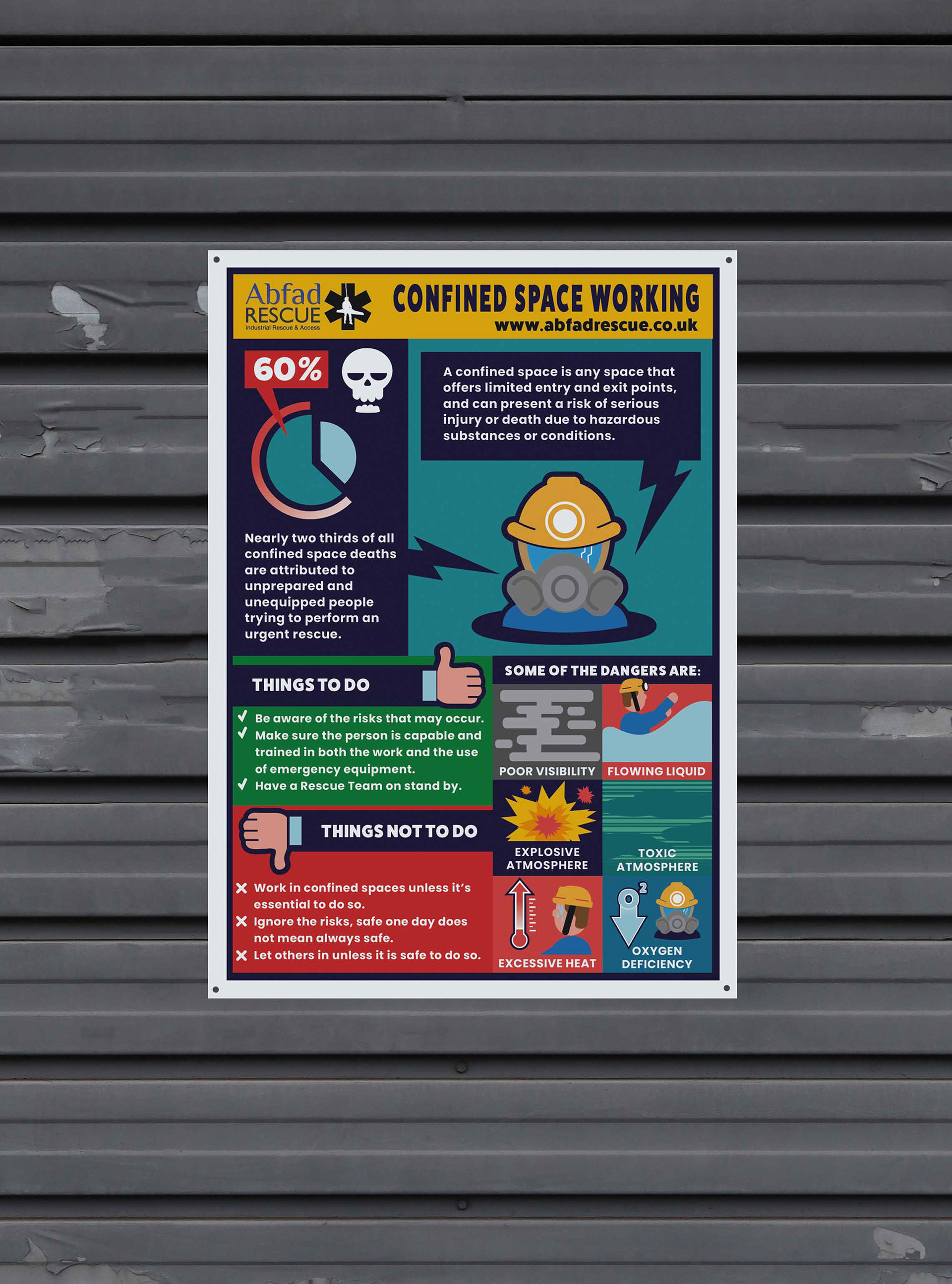
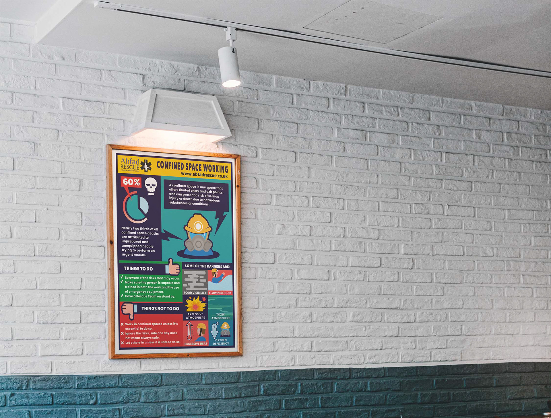
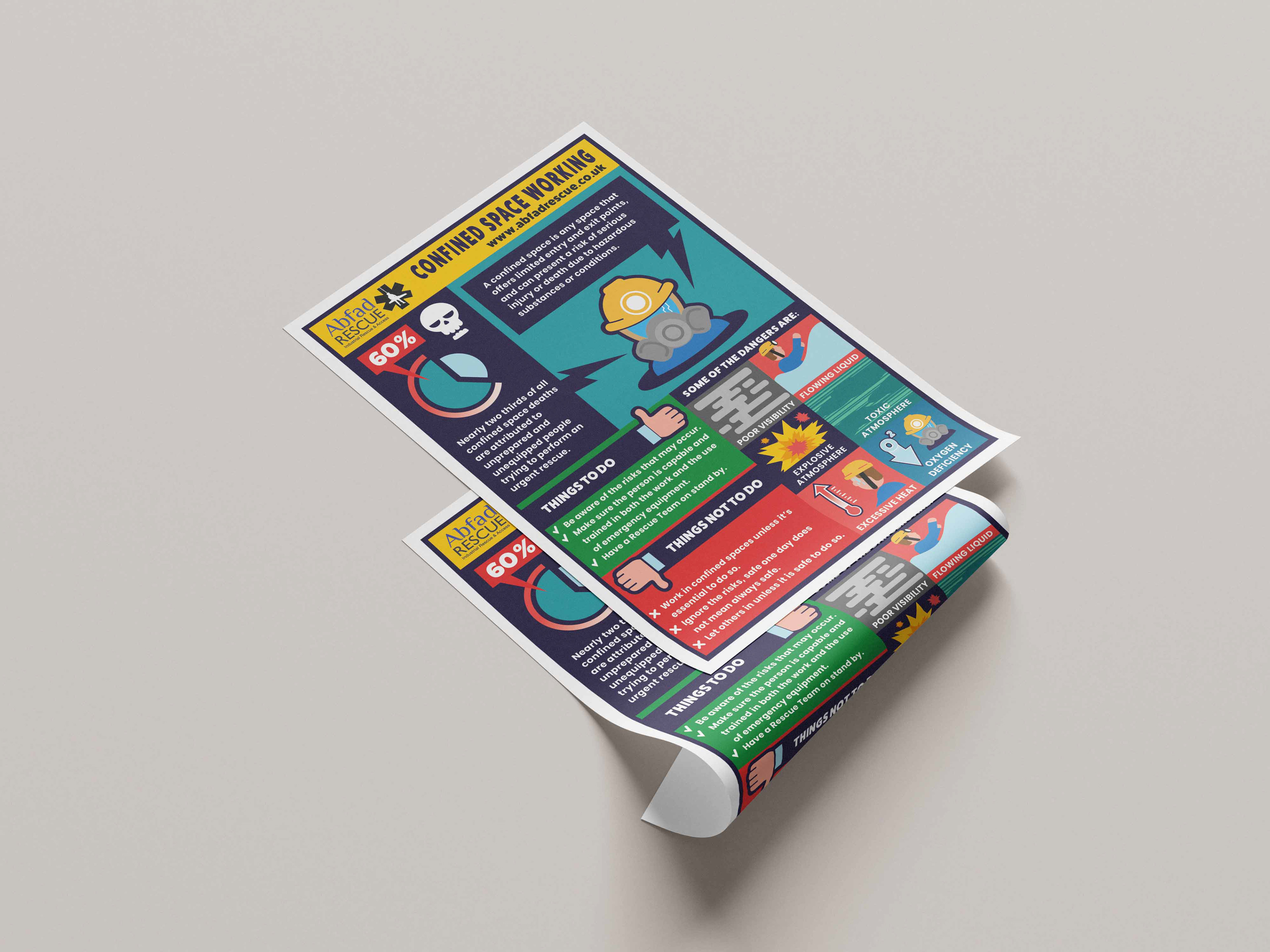
A visually engaging and professional infographic was created that raises awareness of confined space dangers, provides clear, actionable safety guidance, and positions Abfad Rescue as a trusted industry leader. Unlike standard safety posters, this infographic avoids text-heavy layouts and generic clipart, instead using bold colours, strong narrative structure, and memorable graphics to stand out in busy industrial environments.


Brand Visibility
The Abfad Rescue logo and website are placed prominently at the top for instant recognition. The Color palette incorporates Abfad’s corporate colors with high-contrast backgrounds for visual attention and readability.
Visual Hierarchy
Logical flow: definition → statistic → things to do/not to do → dangers.
The 60% statistic highlighted in bold red, supported by strong iconography (skull + pie chart).
Iconography & Illustration
Custom icons illustrate hazards (poor visibility, flowing liquid, toxic atmosphere, etc.), aiding instant recognition and easy to digest for all levels of viewer. Alongside universal symbols (thumbs up/down) to clarify “Do’s and Don’ts.”
Typography
Strong headline to project authority, paired with a clean, sans-serif body text to ensure accessibility of the main information. Text colour on contrasting backgrounds improves the clarity in poster/training contexts.
Colour Use
A high contrast colour scheme has been used to enhance readability and draw instant attention. Drawing inspiration from the high contrast colour schemes of warning signs.
