
Die Cutting Services
Die Cutting Services is a specialist company providing precision cutting solutions for a wide range of industries. Their core values are accuracy, reliability, and professionalism. This needed to be reflected in a modern brand identity that clearly communicates their expertise.
The challenge was to create a bold, professional identity that directly communicates the concept of cutting. Ensuring the design feels modern and versatile, whilst positioning Die Cutting Services as a trusted, precise, and forward-looking partner to do business with.
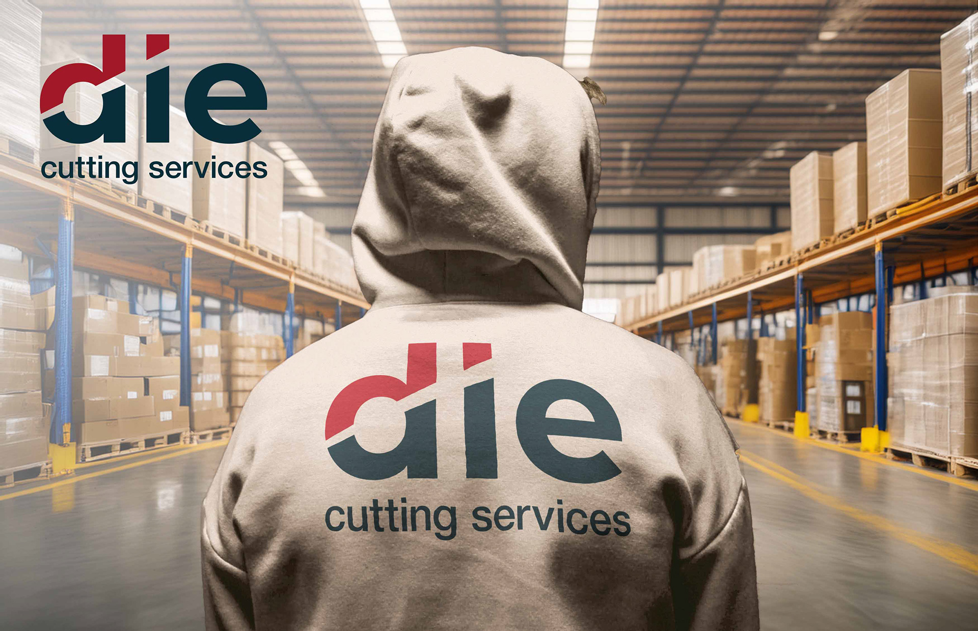
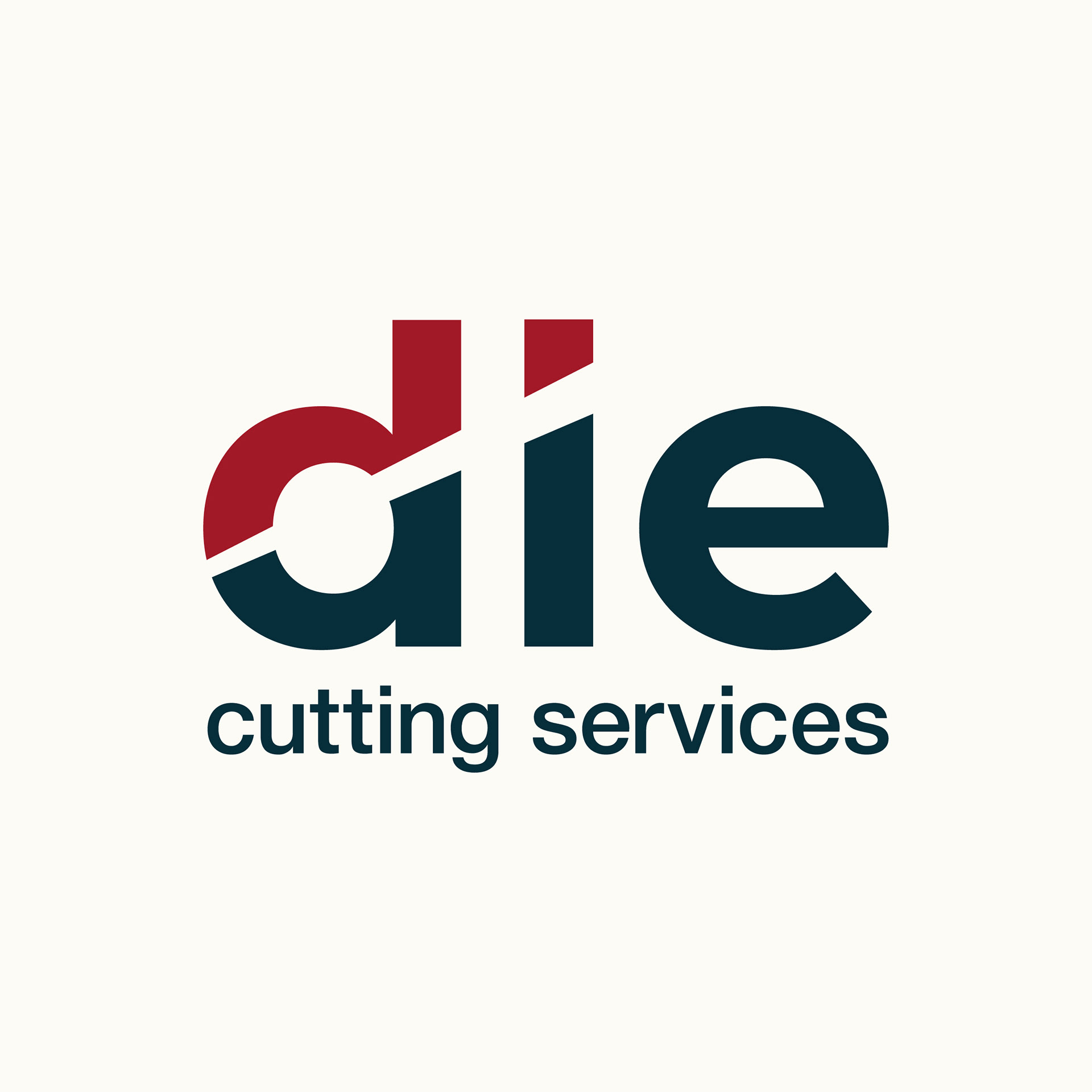
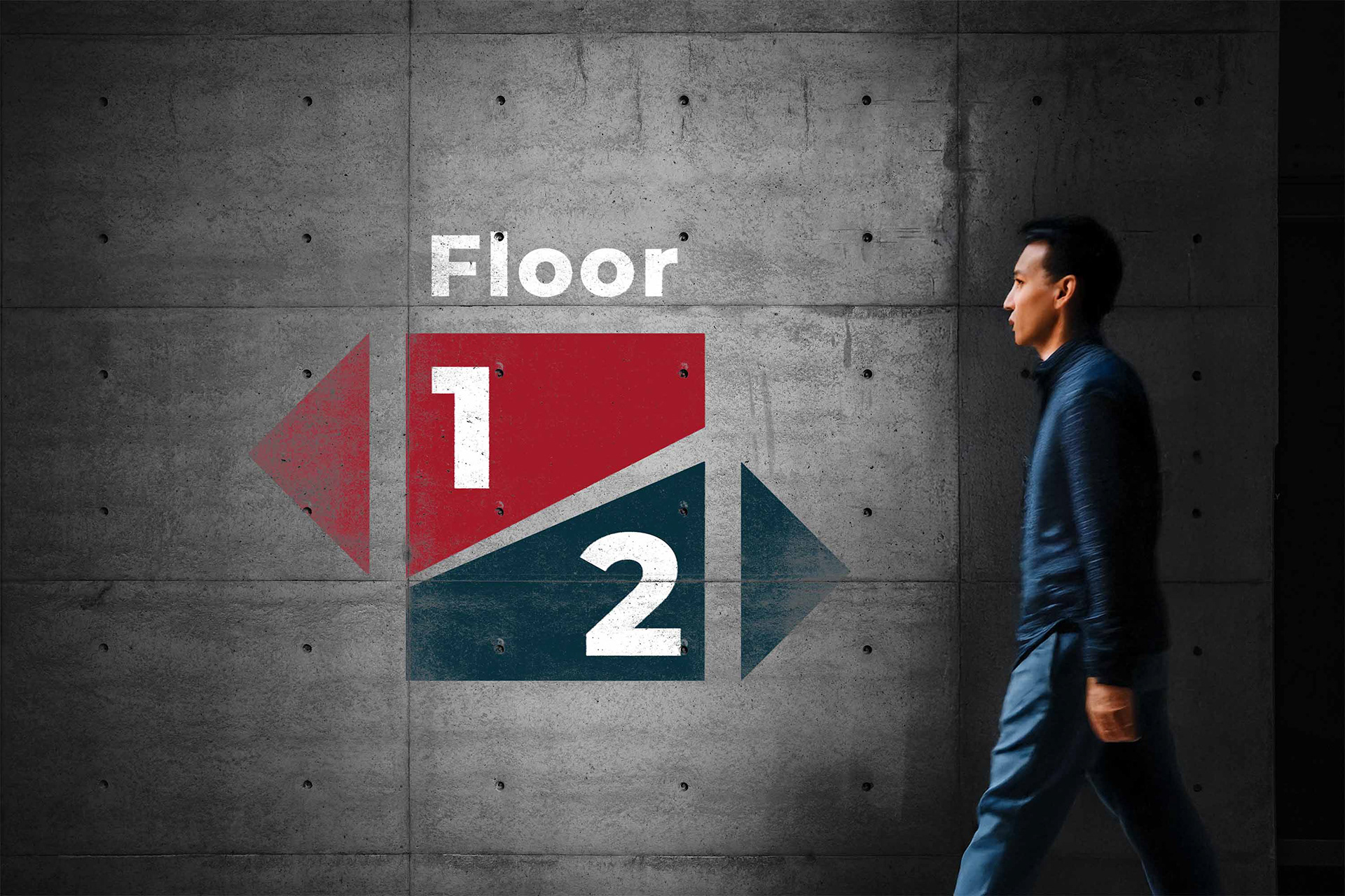
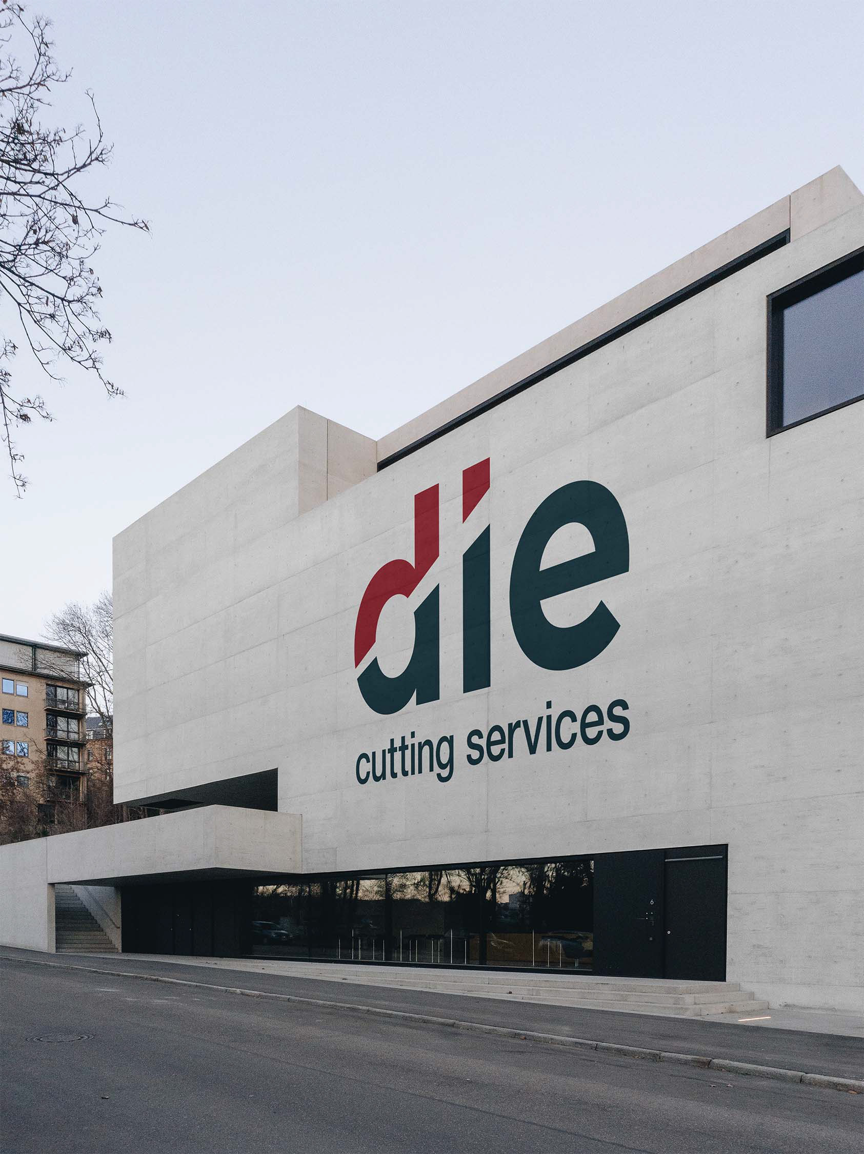
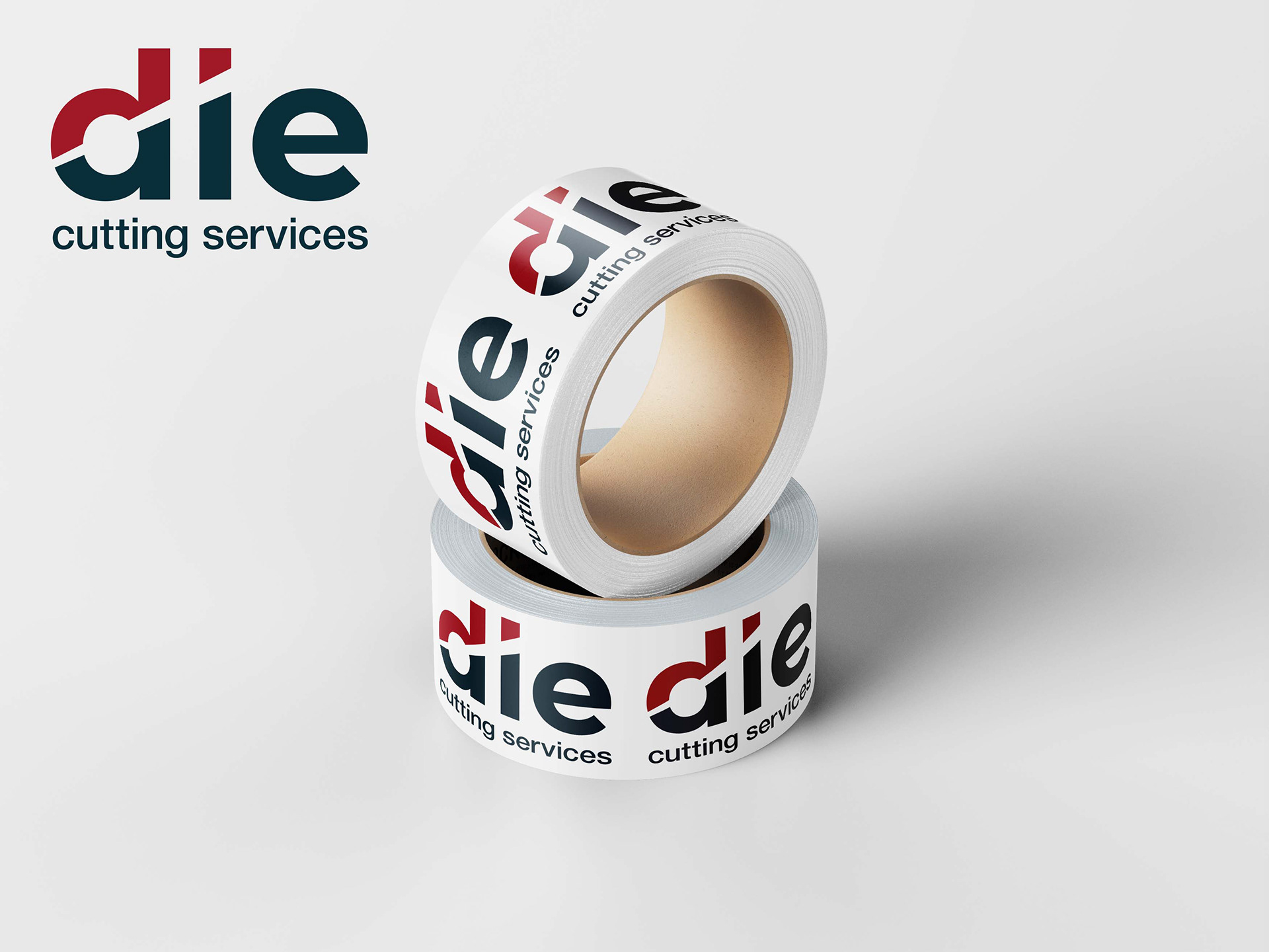
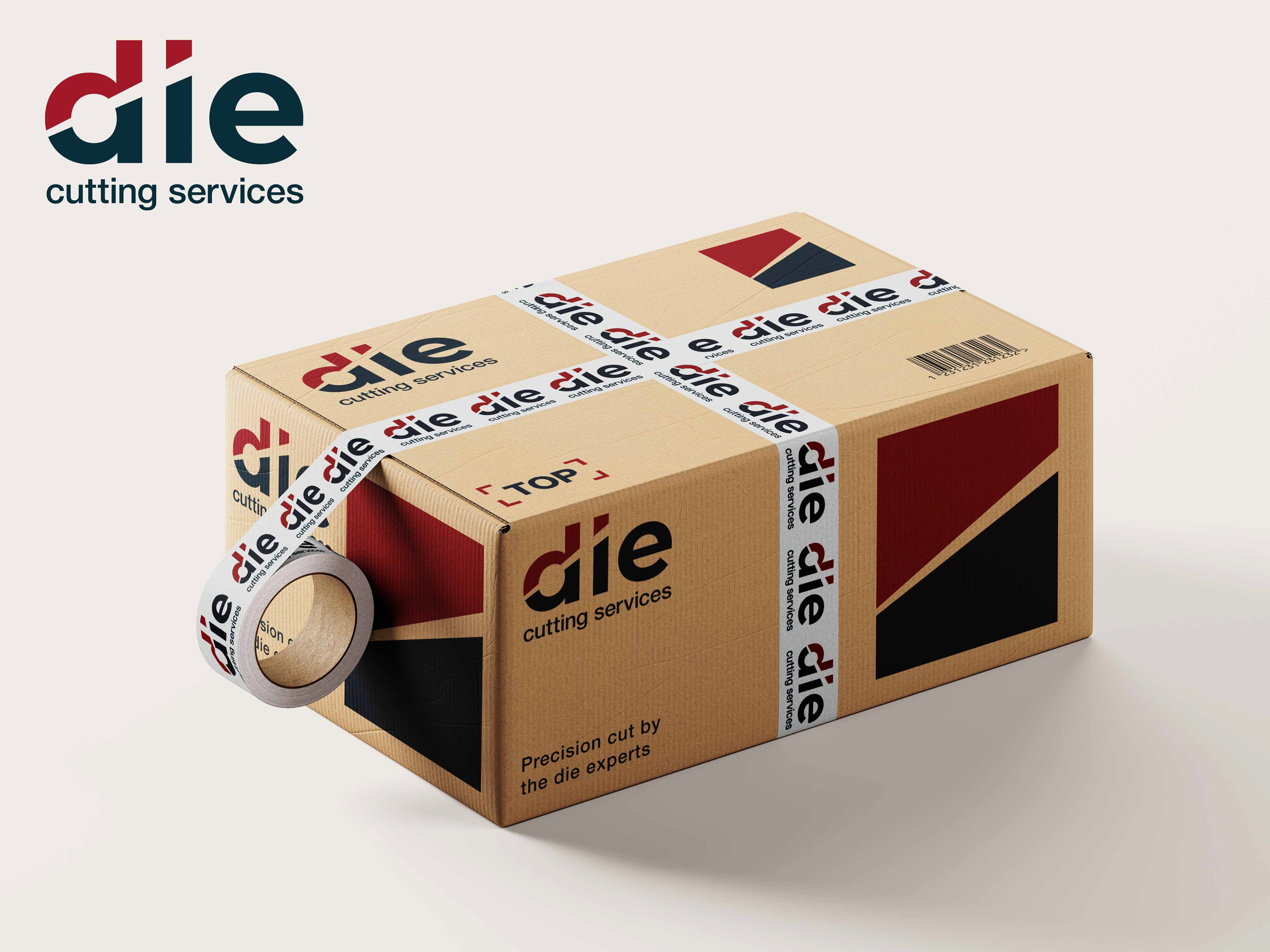
The new visual identity is built around a subtle but powerful visual cutting metaphor, tying it directly into the business. The diagonal cut through the letters “d” and “i” represents the company’s core service — precision die cutting. The upward-right diagonal direction of the cut implies progress and forward movement. The two-tone split (red + blue black) emphasises separation and accuracy, while creating strong visual impact.
The lowercase sans-serif typeface was chosen to balance approachability and professionalism, ensuring the brand feels both strong and welcoming.
The colours of the brand represent:
Dark Blue Black - strength, reliability, and authority.
Bold Red - energy, precision, and action.
This pairing ensures high contrast and visibility, while also making the logo adaptable for industrial and corporate applications.
This pairing ensures high contrast and visibility, while also making the logo adaptable for industrial and corporate applications.
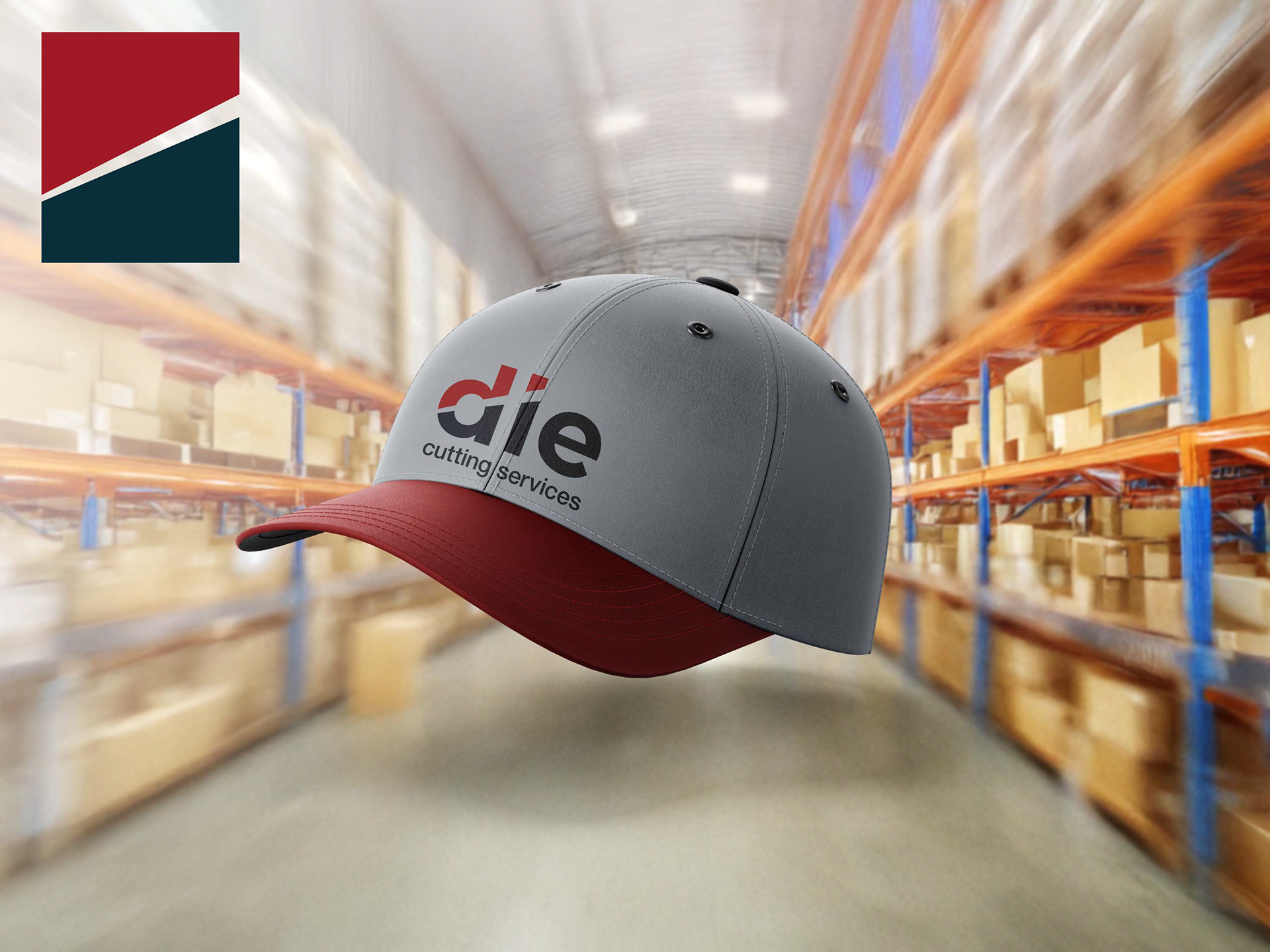
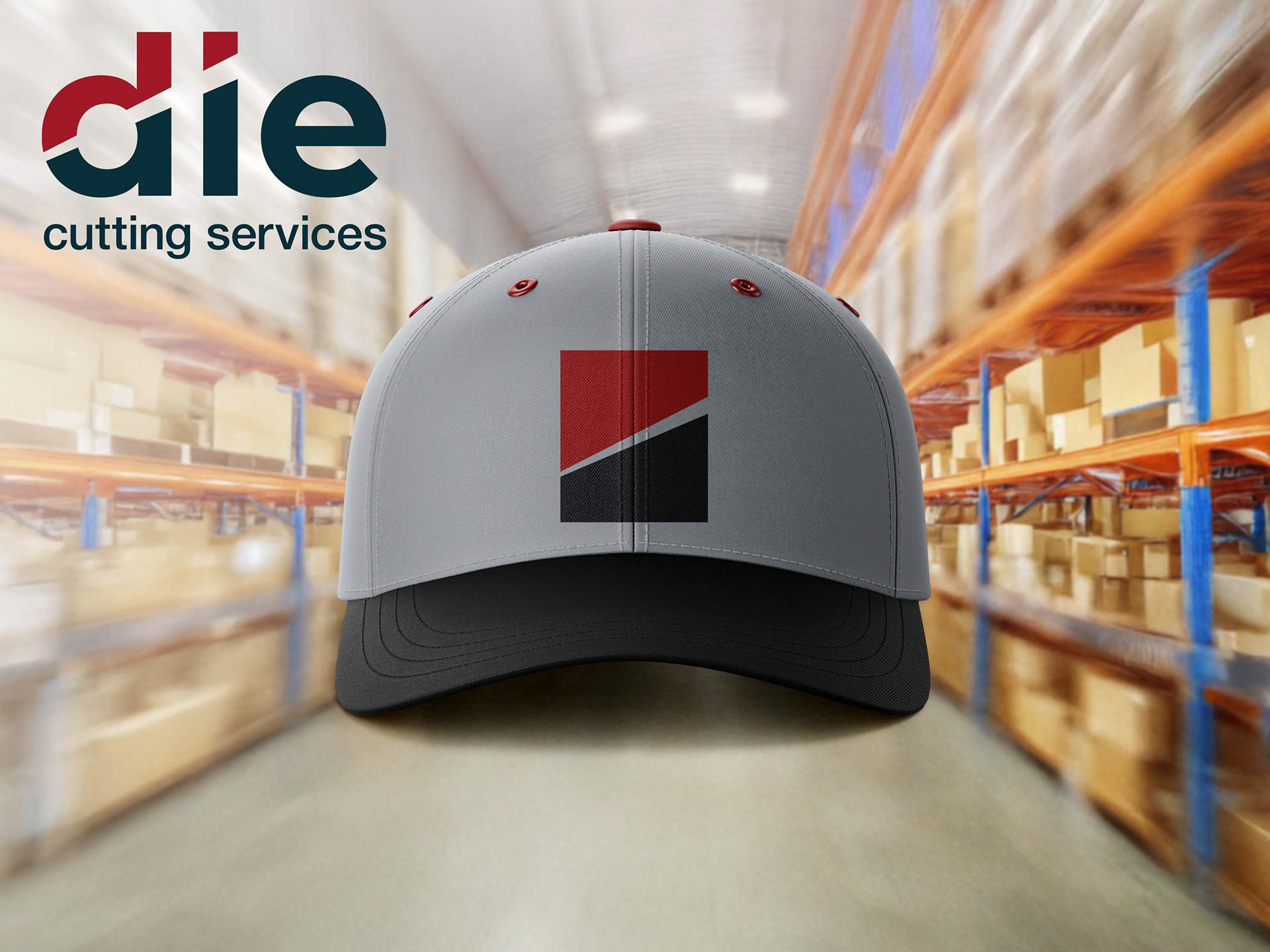
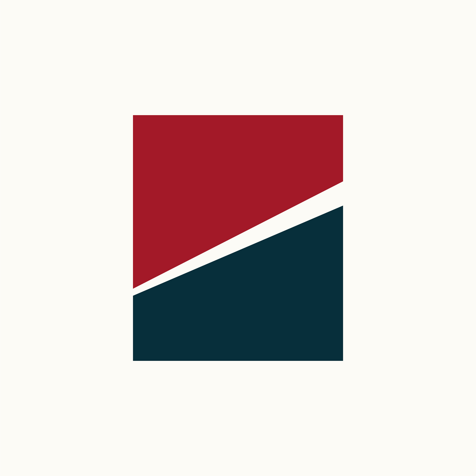
The accompanying icon also embodies these concepts and adds flexibility across brand applications. It compliments the main logo well; the clean block shapes give it a modern, professional, industrial feel, which is perfect for the company.
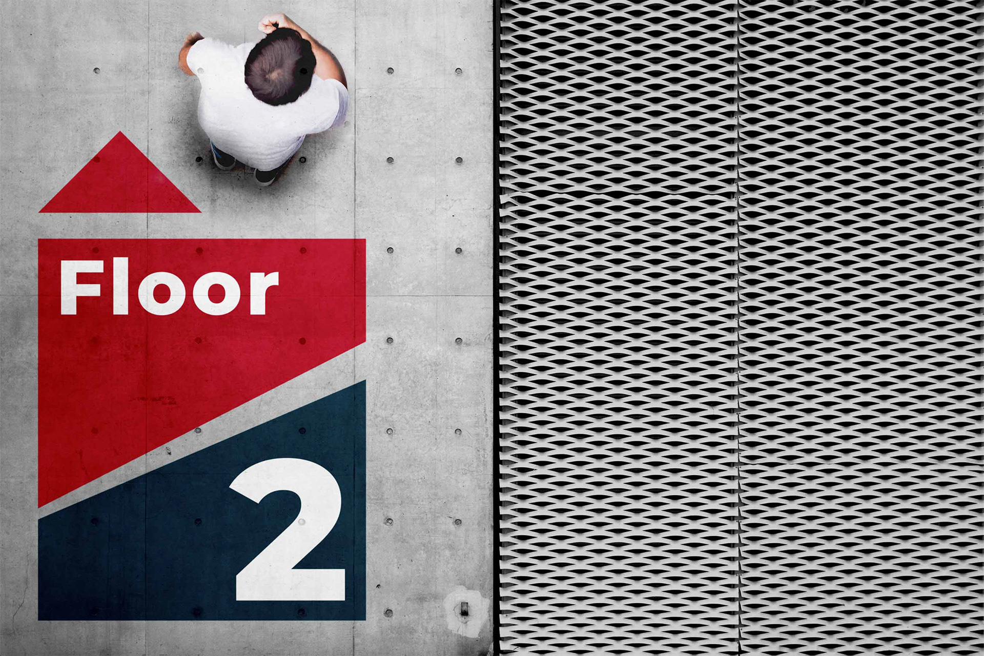
The final logo and visual identity is a modern, professional design. The simple visual cut instantly communicates the company’s purpose and provides memorable visual interest.
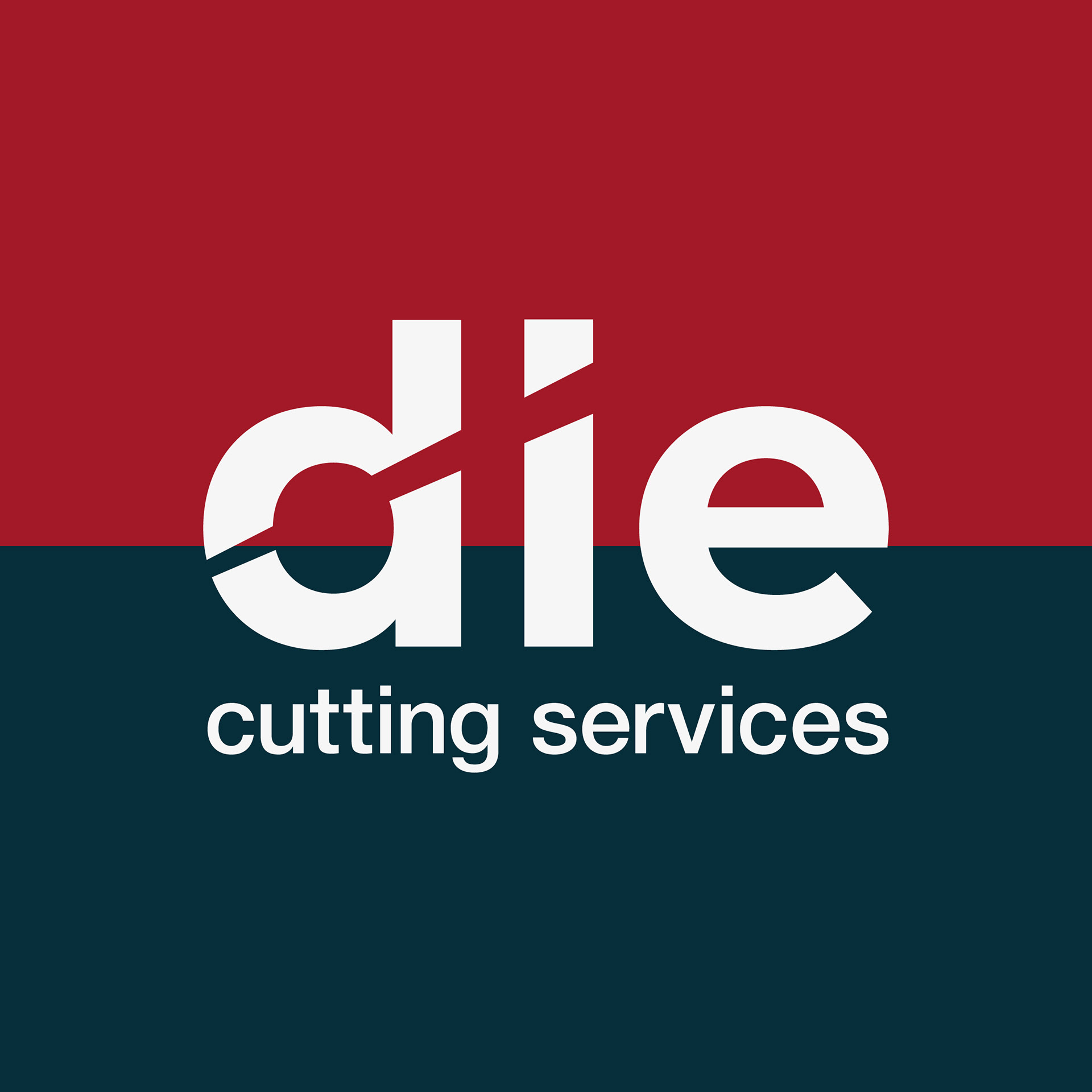
It is versatile, works in black & white, single colour, and at various scales. It provides the company with a professional but approachable feel. Balancing industrial strength with modern design clarity.
It is importantly aligned with the brand values; precision, reliability, and expertise are embedded in the visual identity.