Friends of the Park
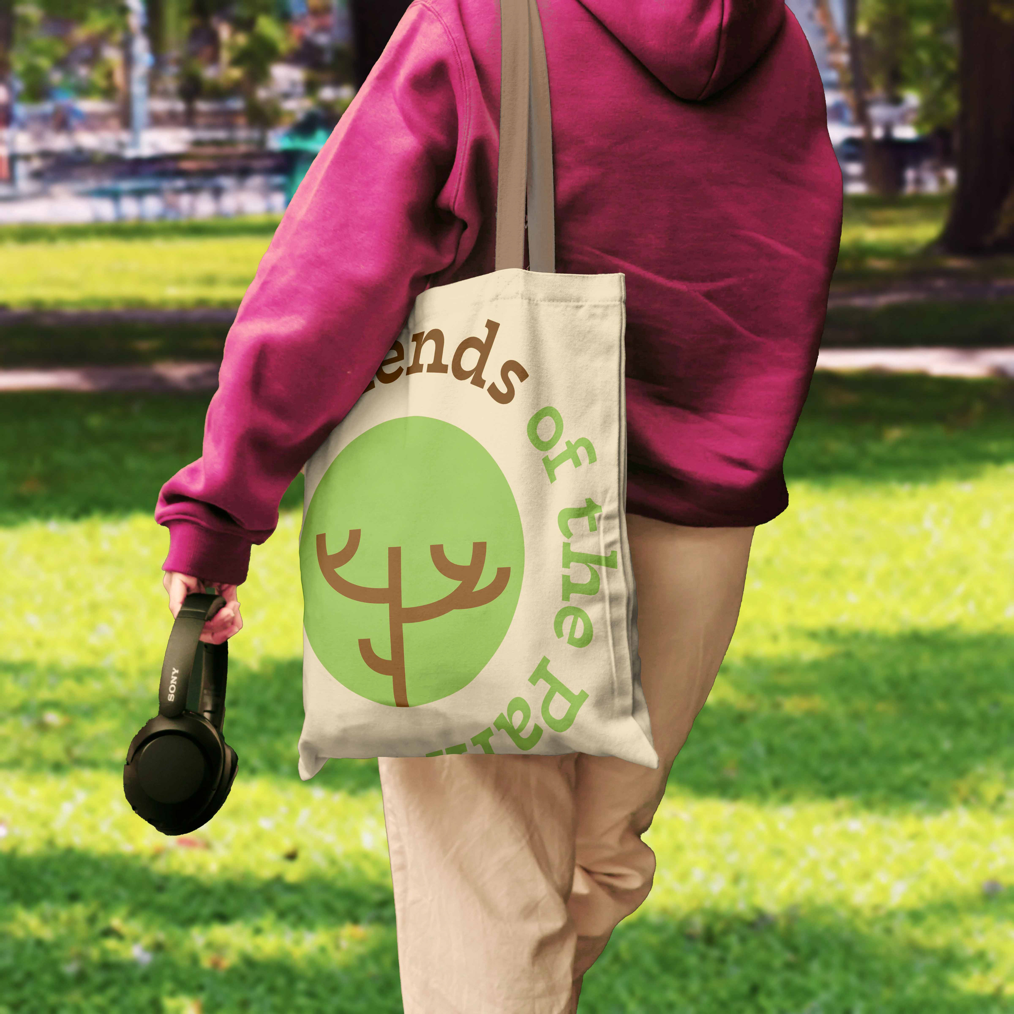
Friends of the Park is a grassroots community initiative dedicated to preserving and enhancing local green spaces. The organization wanted a logo and visual identity that communicated its mission of care, stewardship, and inclusivity while remaining approachable and versatile for use across signage, social media, and community events.
The design Objective was to create a logo that reflects nature, growth, and community care. Ensuring the identity feels welcoming and approachable, encouraging public involvement. And, develop a versatile mark that works in both print and digital contexts.
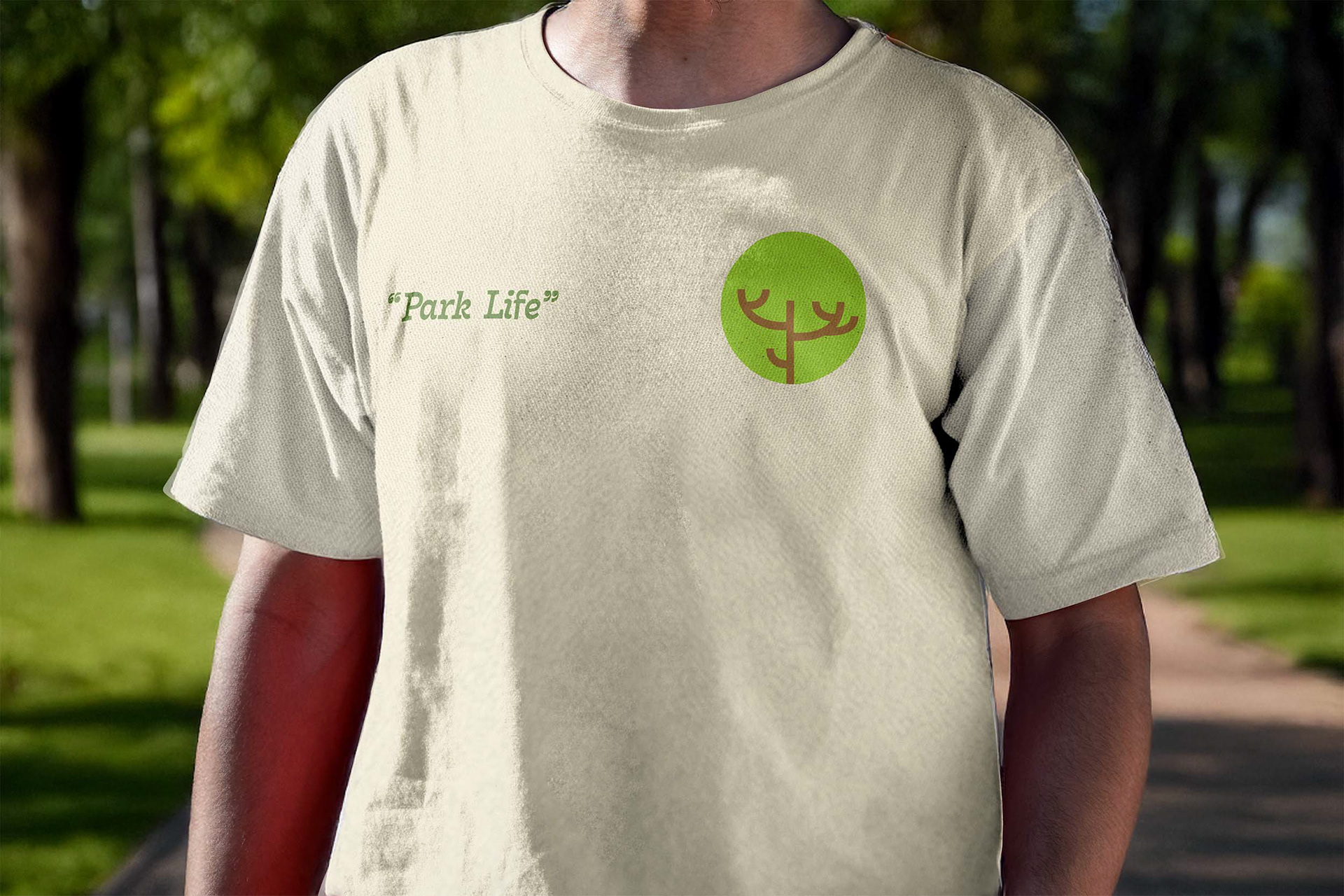
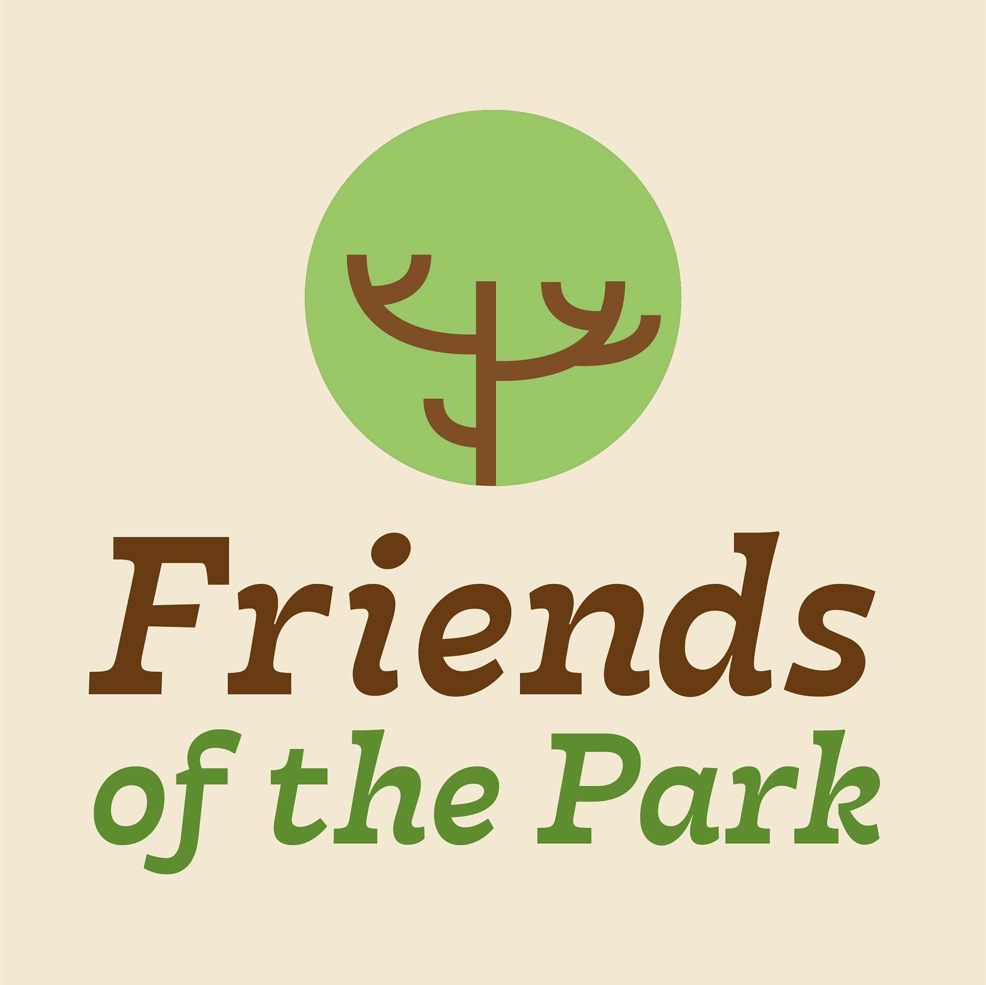
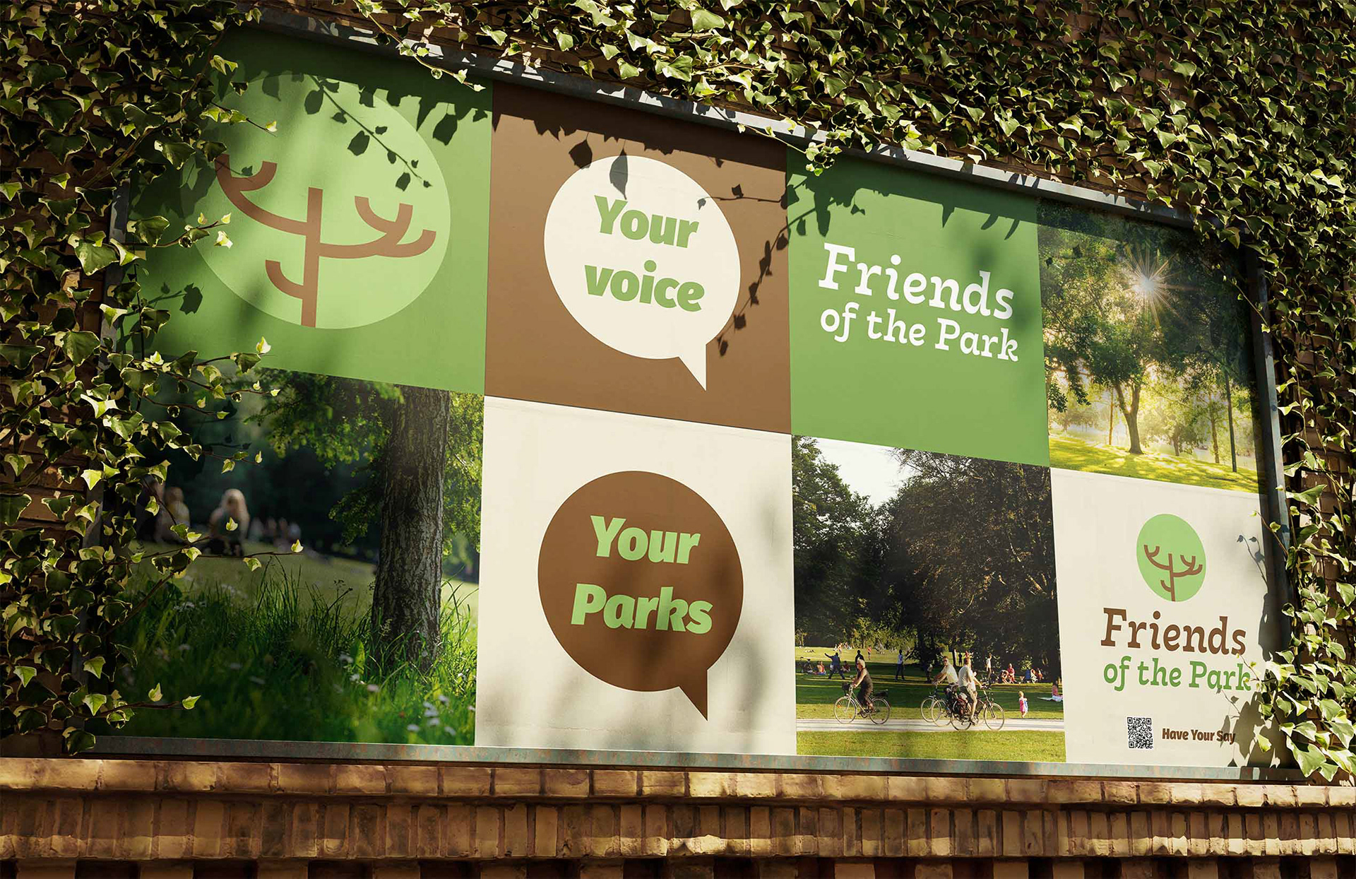
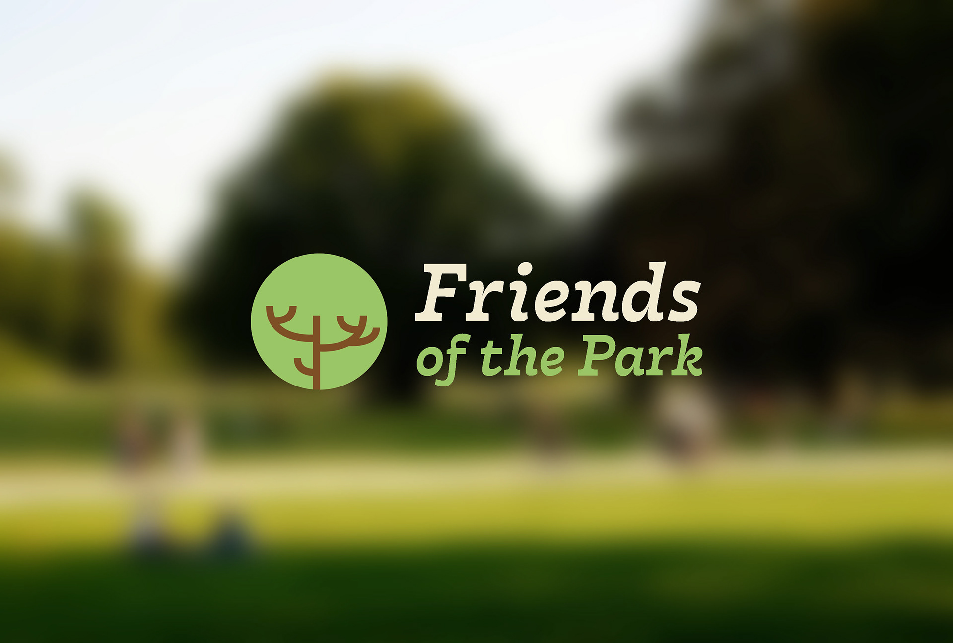
The identity Inspiration was trees, growth, and the circular form of parks and communities gathering together. A simplified tree branch contained within a green circle, symbolizing protection, growth, and care for the environment. Paired with the typography of a warm serif font for Friends to convey trust and tradition, this softer serif typeface adds friendliness and balance to the bold icon.
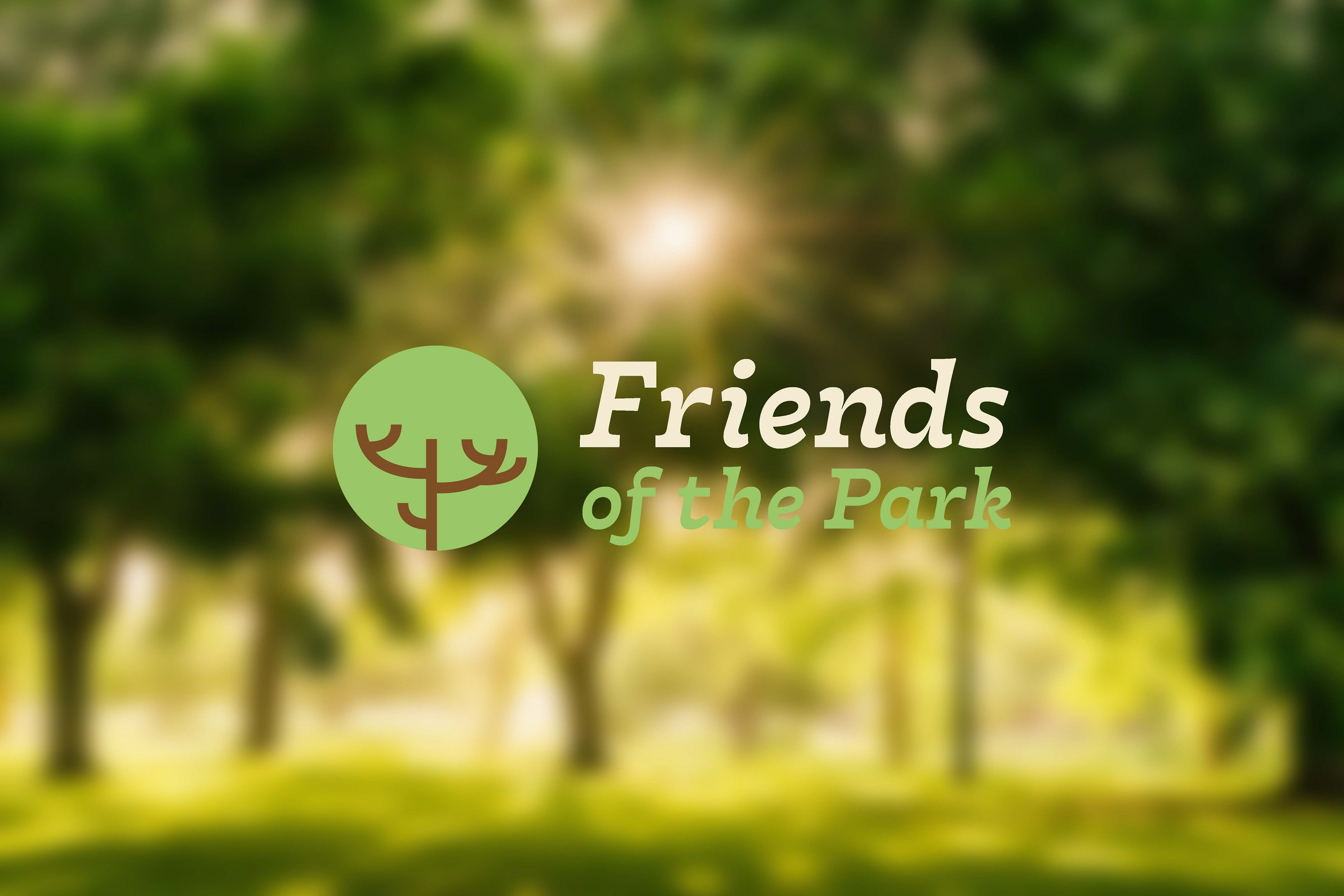

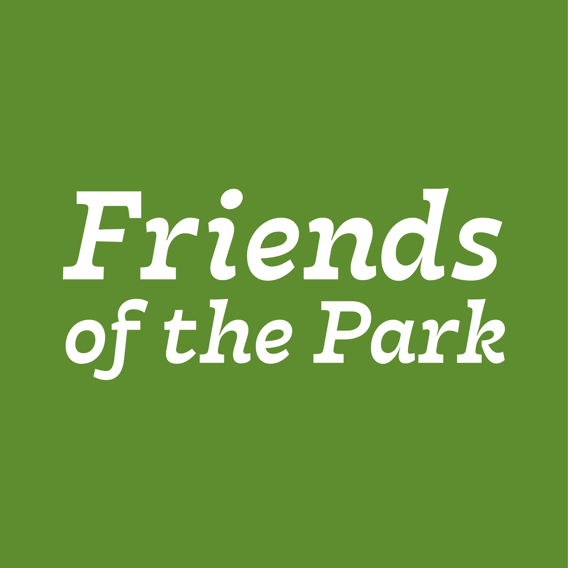
The colour palette is rooted in nature to reinforce the environmental connections. Bringing vitality and grounding the identity. Neutral backgrounds and image selection to keep the design strong, fresh and accessible. The brand voice shines in the identity - Inclusive, open and welcoming to all members of the community. Caring – A reflection of stewardship and environmental responsibility. Whilst being honest and unpretentious, built from the community up.
The final brand identity for Friends of the Park balances professionalism with warmth, giving the community a clear and recognisable mark that represents their mission. The logo has been successfully applied across multiple platforms, helping the organisation build stronger recognition and engagement with local residents.