Recovery Plus
Recovery Plus is a substance misuse intervention initiative and help program launched by a local CIC to help recovering addicts change their lives and develop leadership skills to take them forward to a positive life, returning to society stronger and better equipped.
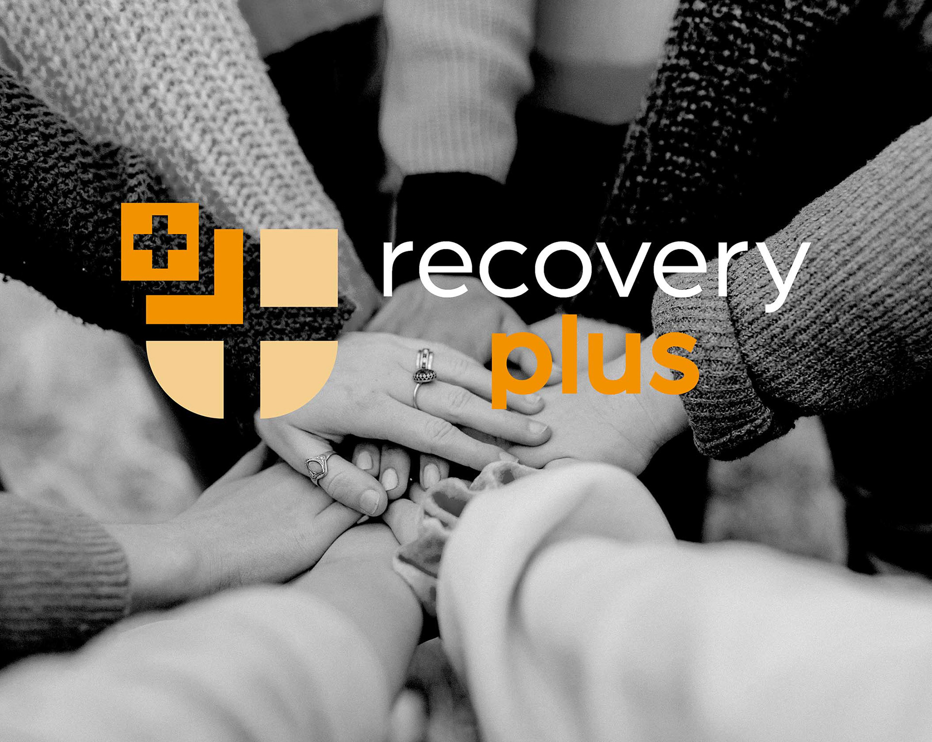
The brand needed to represent trust, safety, positivity, and improvement. It needed to tell the users of the service that Recovery Plus will give you the help you need, go above and beyond to do it, and put in place the foundations needed to create a better life.
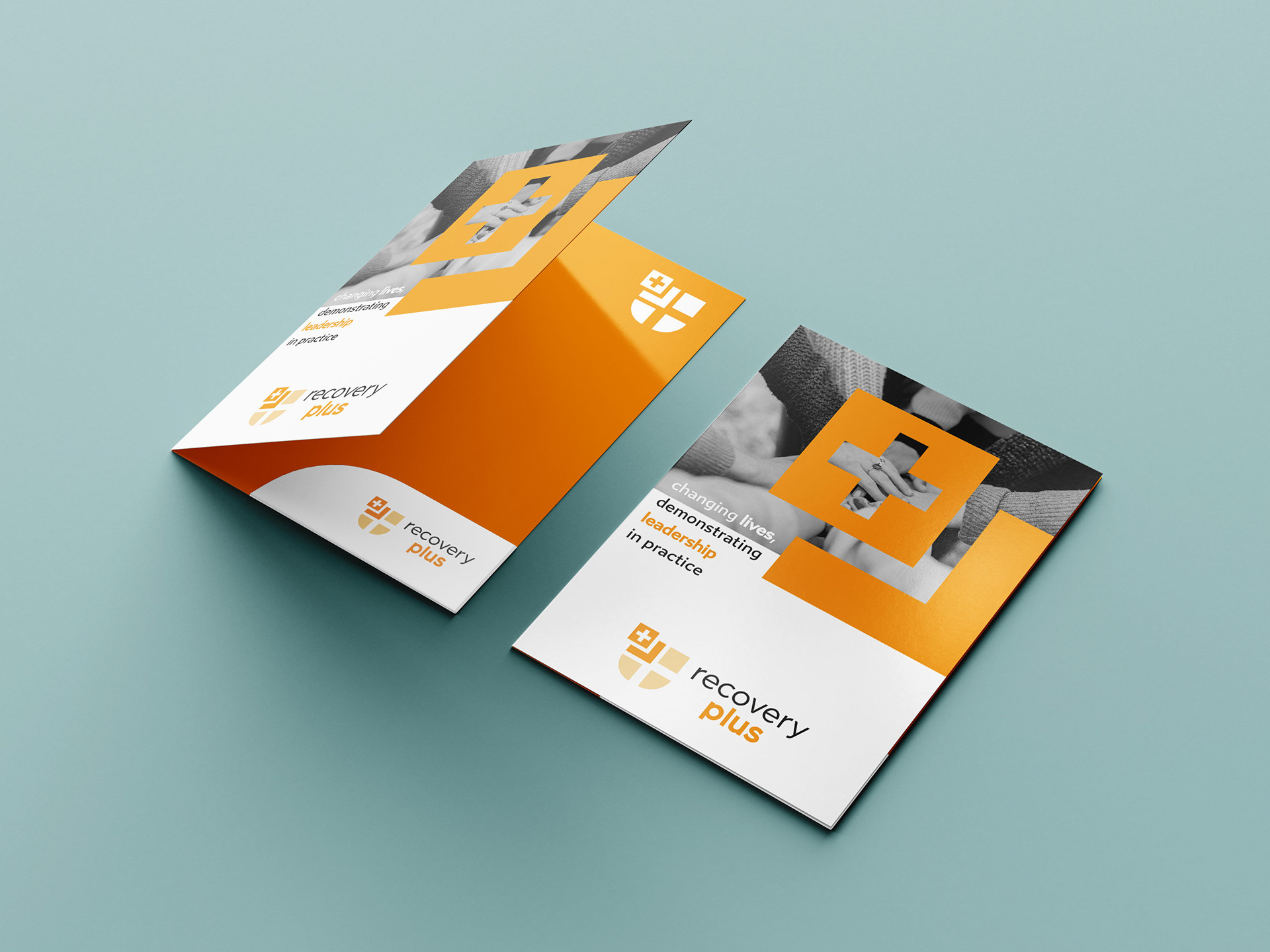
The final design is clean, modern, professional, but gives a warm feeling that recovery is the right step.
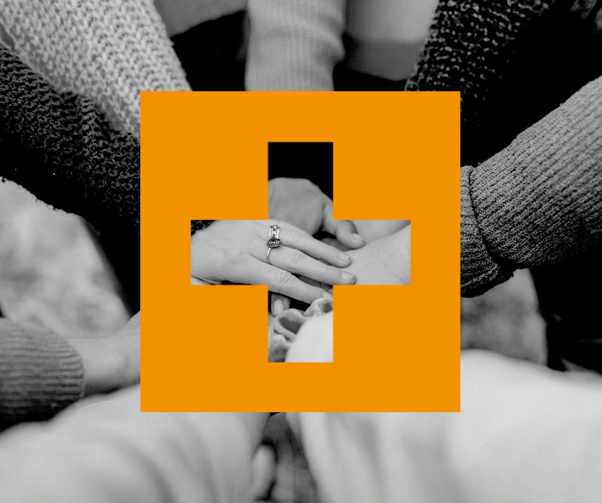
The unique cross and shield icon evokes the feeling of trust, safety, protection and reliability. It subtly says "we guard your health" and "you're safe with us". The quadrants in the shield give the feeling of structure, balance, and methodical care, reassuring patients that recovery is systematic and guided.
The colours chosen to represent the brand give both a feeling of positivity, calming, balance, clarity, and professionalism. It gives the brand that attention grabbing status whilst also making the brand feel more approachable and grounded.
The typography was chosen for its friendly and accessible feeling, so as not to be overly formal or intimidating. The boldness of the Plus draws attention to the service being more than just recovery, emphasising the added value, premium care, and unique edge.