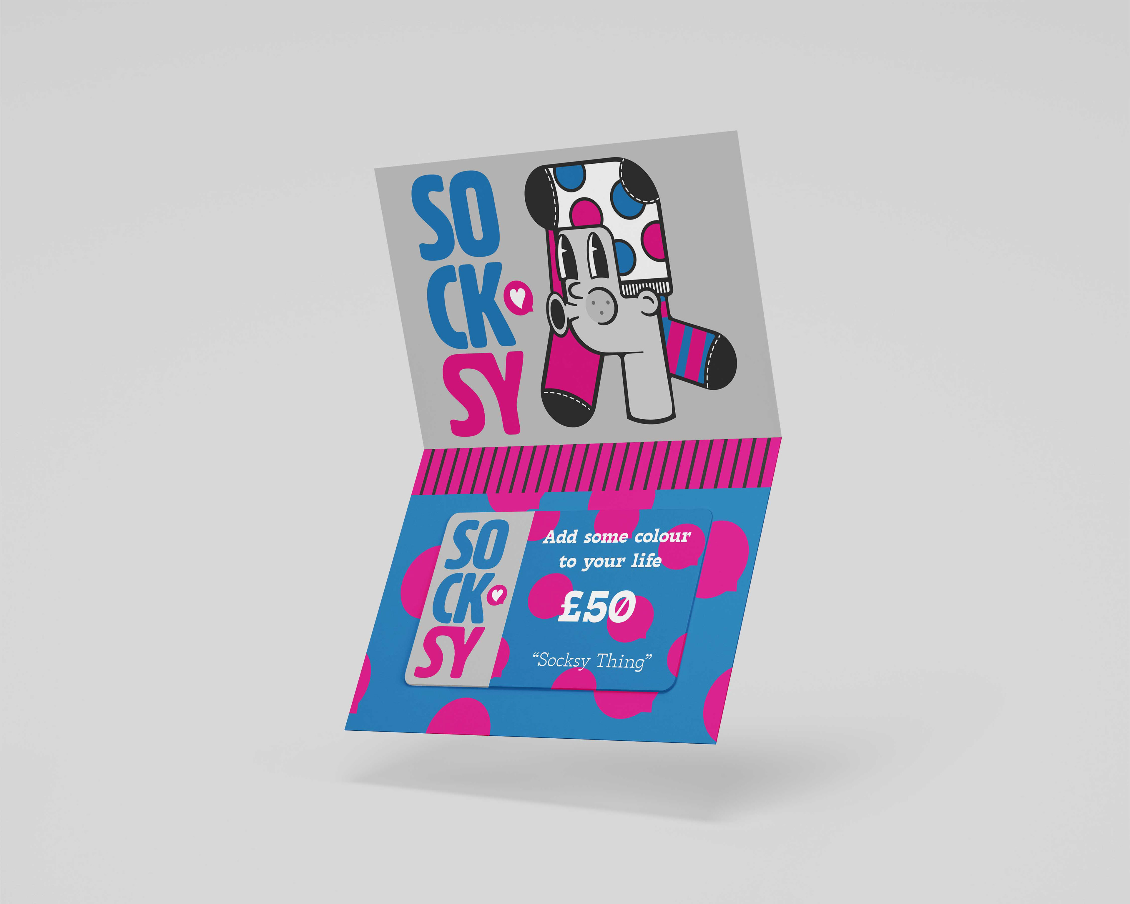
Socksy
Socksy wanted a bold, playful brand identity for their new line of expressive socks aimed at fashion-conscious young adults. The goal was to develop a logo and visual style that would immediately communicate fun, individuality, and a love for colourful self-expression, while staying versatile for online and retail environments.
Socksy's mission and positioning is they aren't just about socks, it’s about attitude. The brand speaks to those who want their accessories to be conversation starters. The personality keywords identified in the strategy phase were:
Playful – Irreverent and fun, with a wink of humour.
Bold – Unafraid of colour, pattern, or quirk.
Inclusive – Unisex, approachable, and welcoming to all.
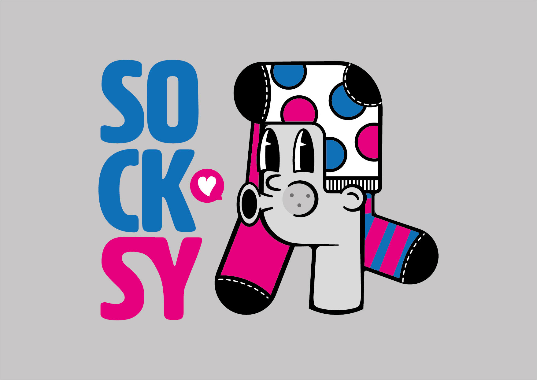
The final logo centers on a custom character made entirely from socks, blending illustration and typography in an unexpected way.
The character needed to be instantly memorable and full of personality. A cartoon-like sock figure with expressive eyes and quirky details was designed to fit the personality of the brand.
The character is not just a logo but a mascot, opening opportunities for playful campaigns and seasonal variations that can strengthen the Socksy brand.
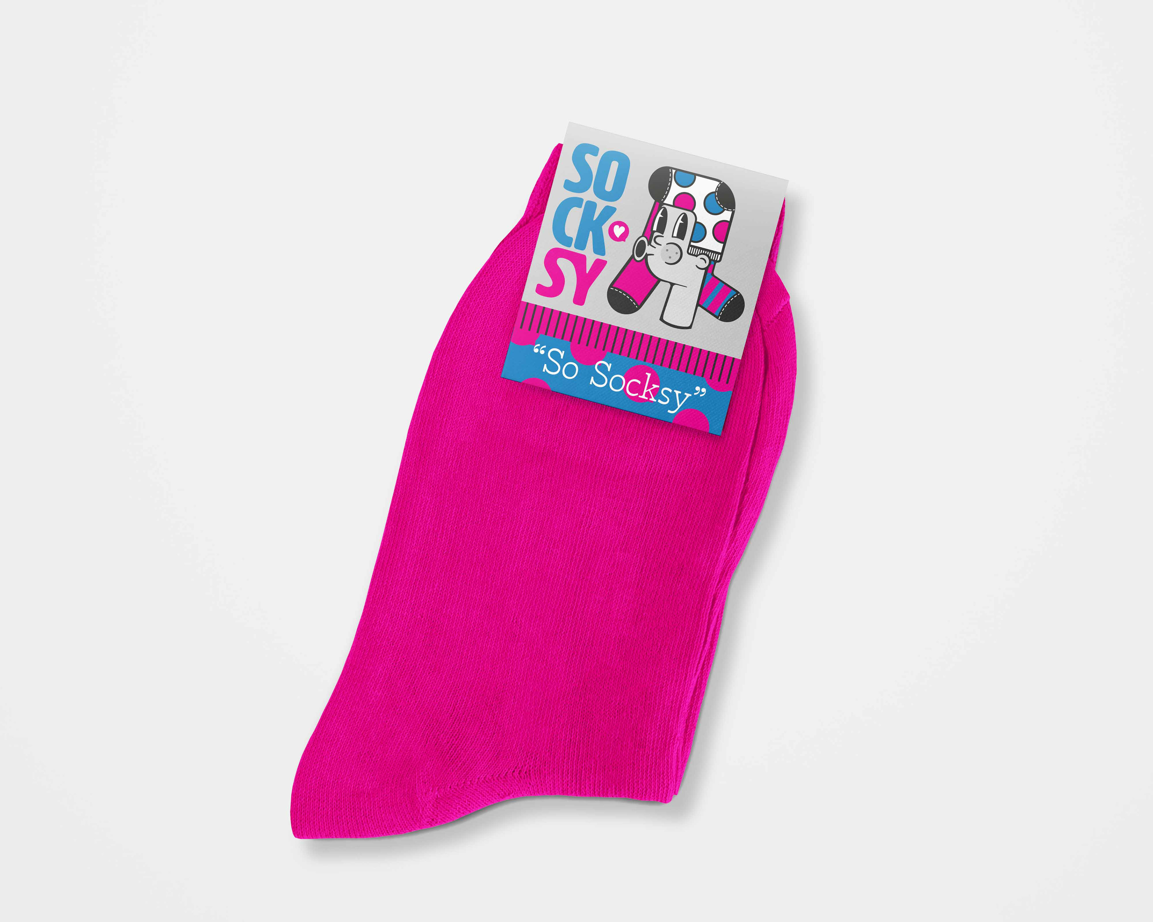
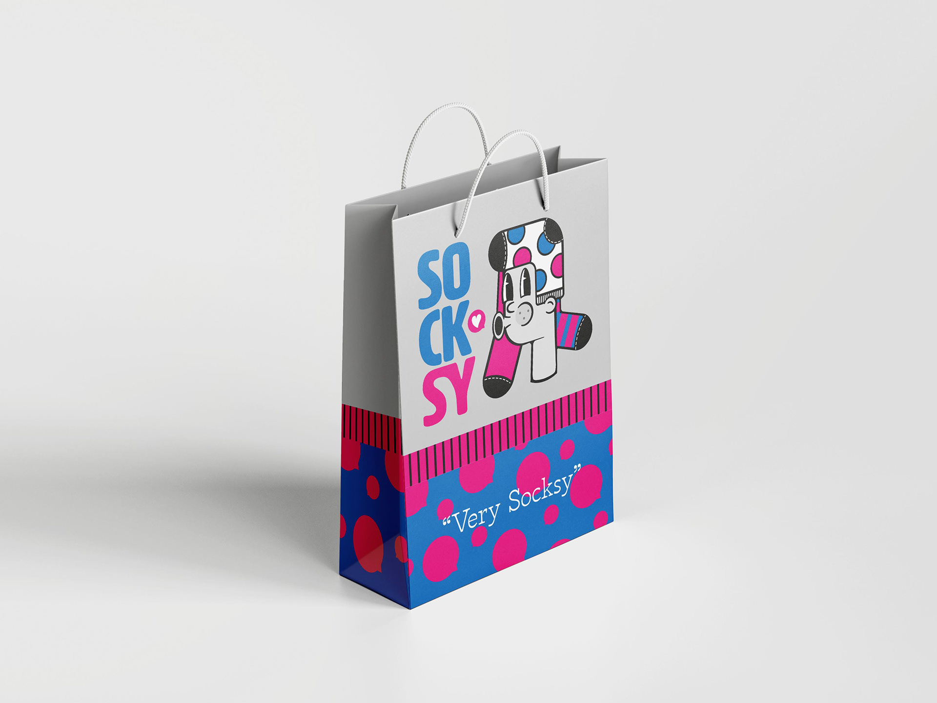
The name “SOCKSY” is split into a stacked format for dynamic balance, with alternating bold magenta and blue to reinforce the playful tone. While also being reminiscent of a sock being pulled on.
The Heart Speech Bubble adds warmth and friendliness, visually hinting at the brand’s connection with customers.
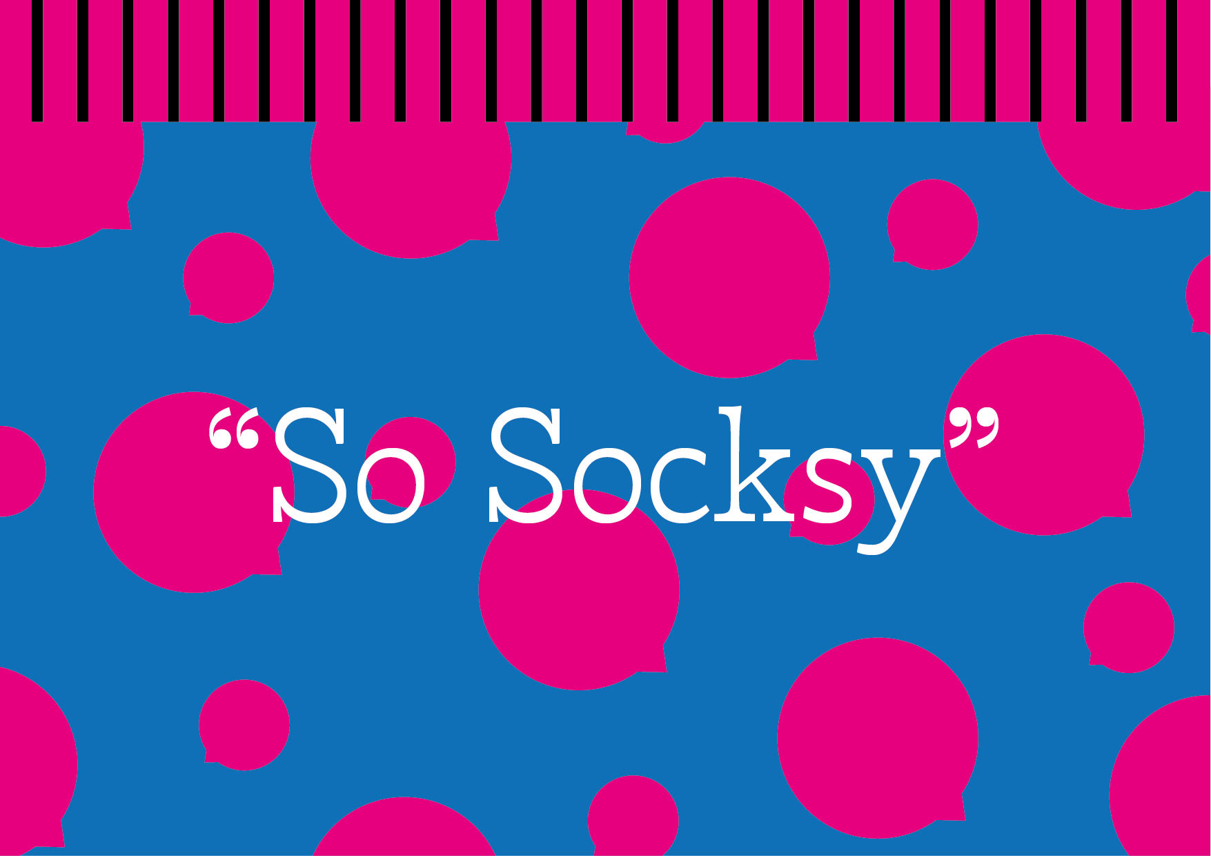
The colour palette is creative, energetic, vibrant, and attention grabbing. Being both bold and trustworthy in feeling.
Socksy’s brand identity is a celebration of fun in fashion. The design system captures the vibrancy and irreverence of the brand’s personality, ensuring every touchpoint radiates the same sense of joy and individuality.