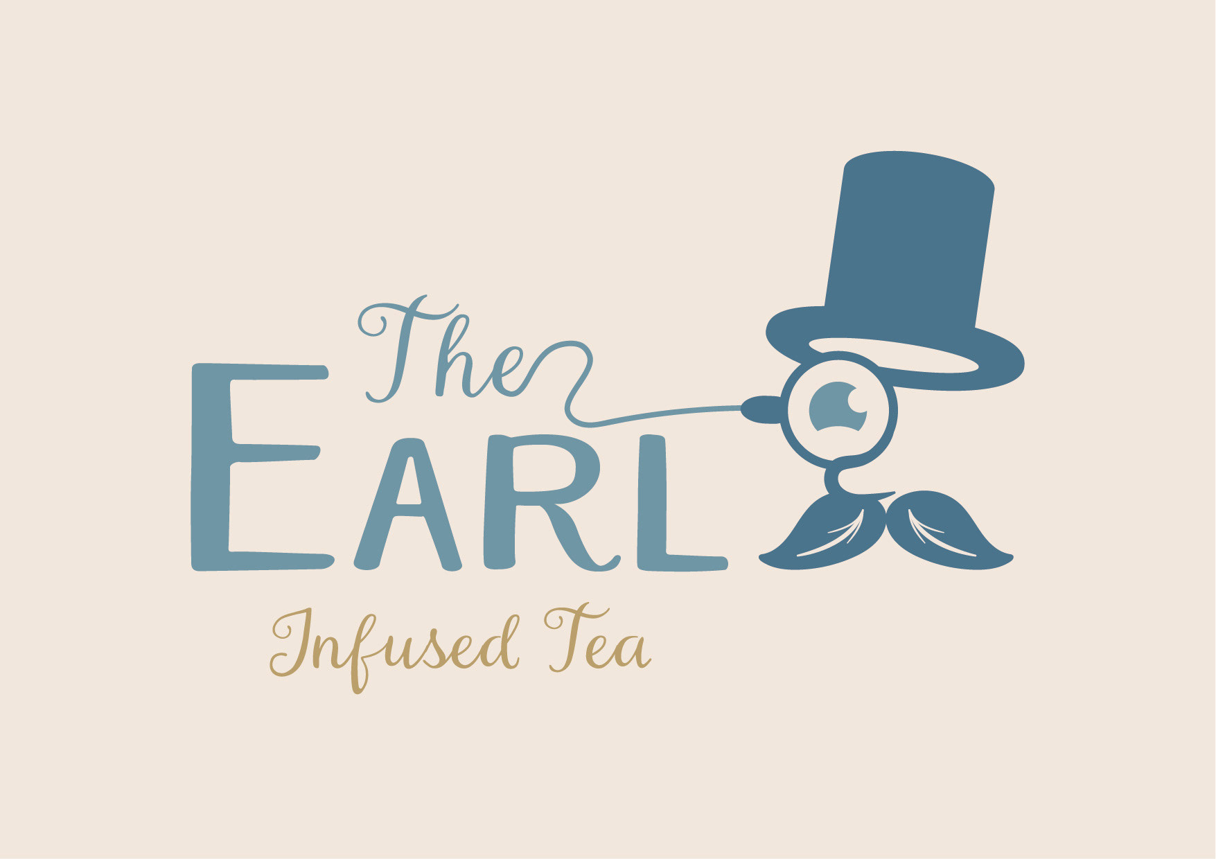
The Earl
The Earl strives to infuse fun and style into the traditional tea-drinking experience by offering premium Earl Grey tea blended with zesty lemon and orange flavours.
Combining the timeless elegance of Earl Grey with the invigorating flavours of lemon and orange to create a refreshing, fun and stylish tea drinking experience.
Aimed at modern tea enthusiasts who appreciate high-quality simple blends and enjoy unique flavour combinations.
The brand had to be portray a visual style that was vintage and elegant whilst at the same time being playful and slightly whimsical, given the fusion nature of the tea. The branding needed to evoke a sense of “We’re classy but not pretentious. We serve high-quality, artisanal tea with a British heritage influence, and we do it with a cheeky wink.” It was designed to give the sense of a boutique tea brand that values tradition but isn’t afraid to be playful.
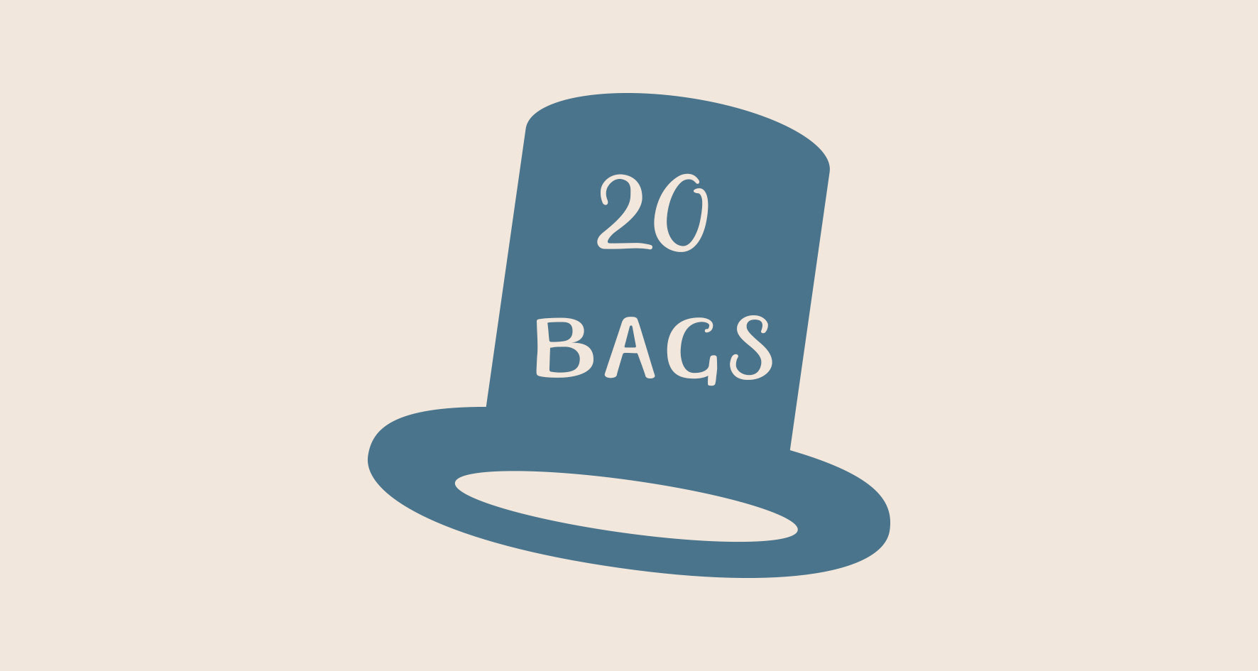
The final branding communicates this in bucketfuls (or should that be top hat fulls).
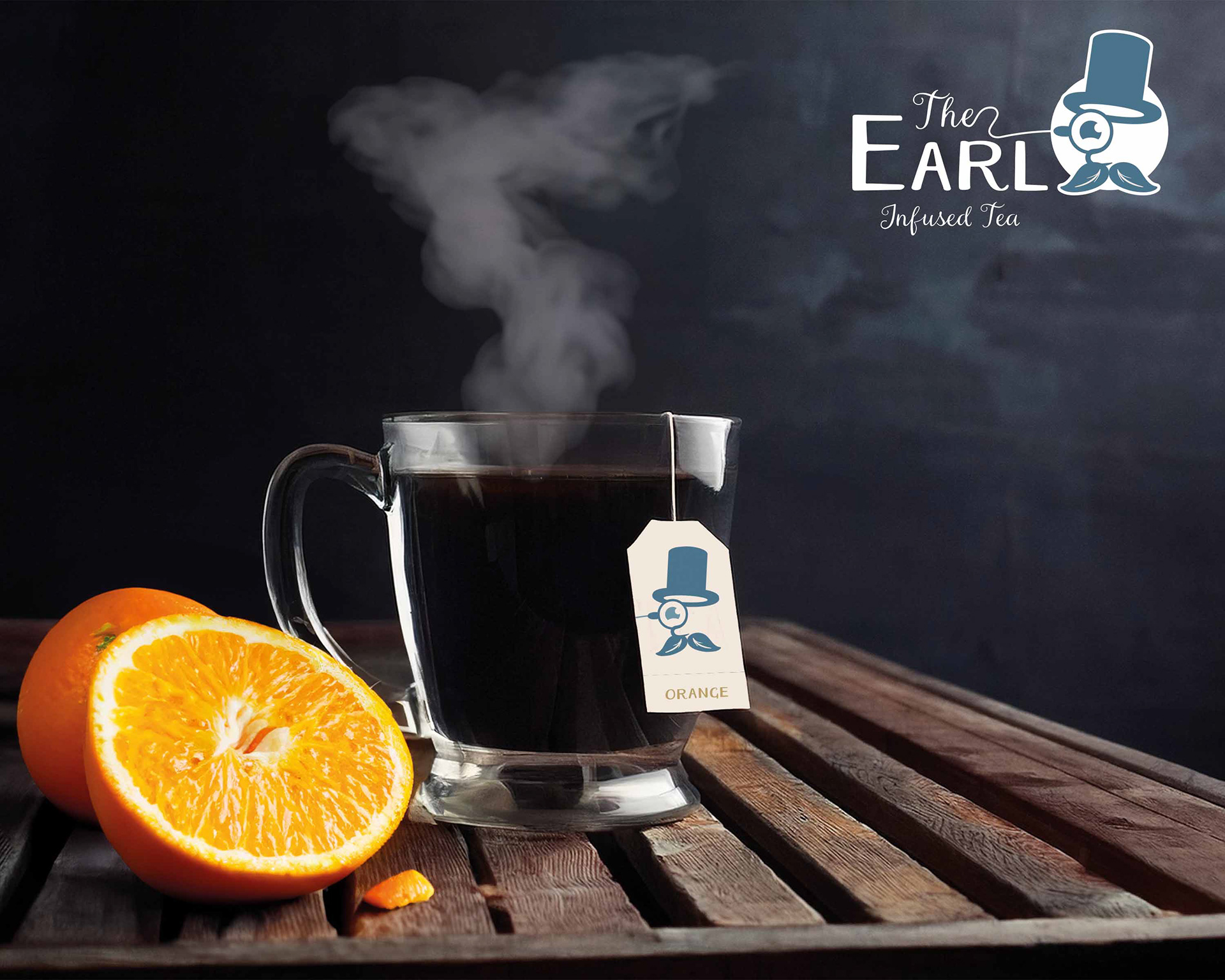
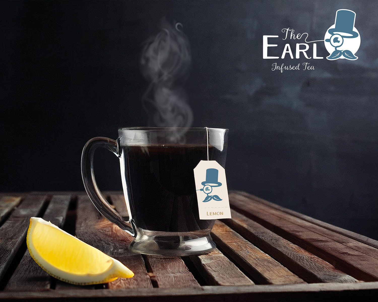
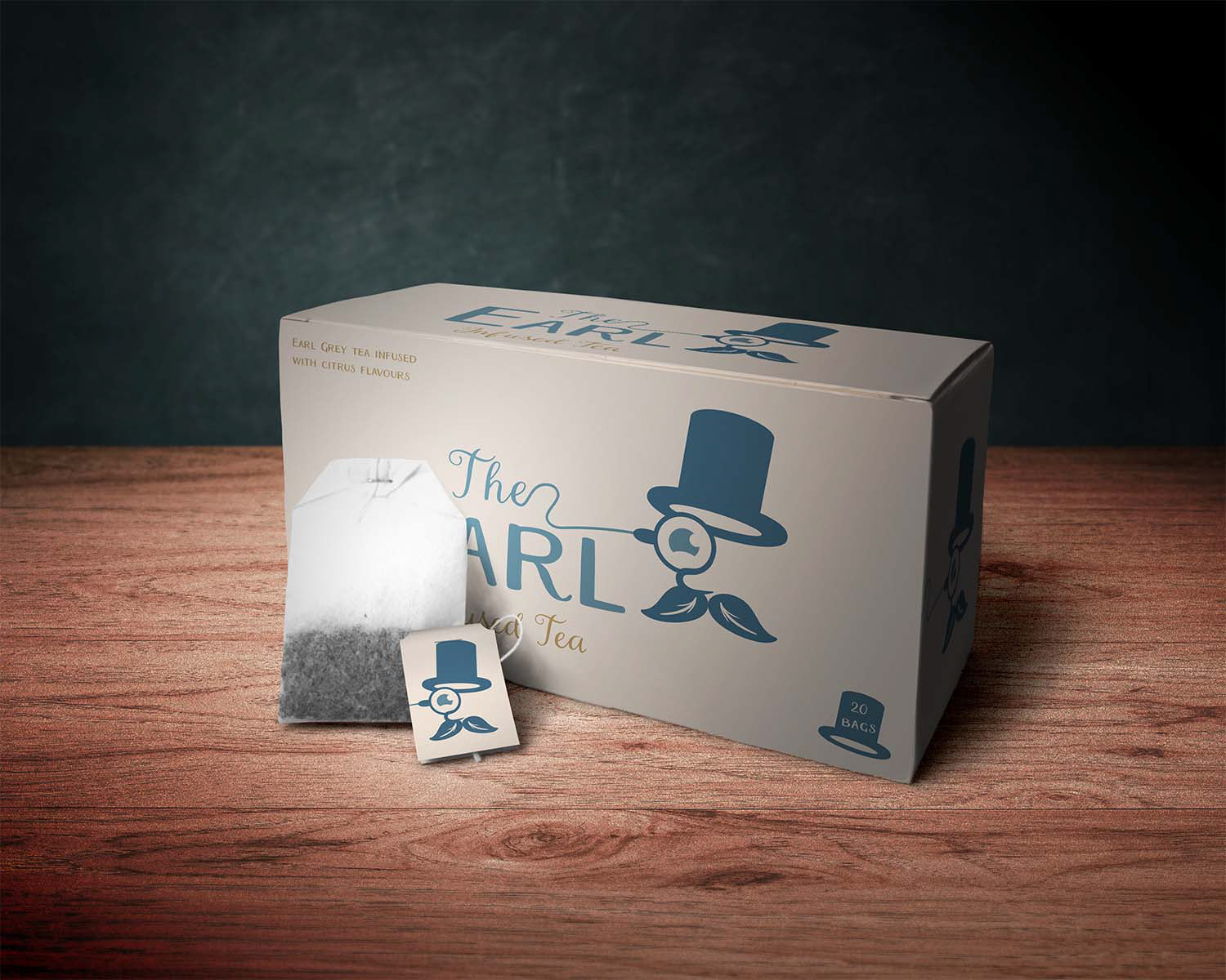
The character design with the top hat, monocle, and moustache, give a visual shorthand for an aristocratic English gentleman; a nod to Earl Grey tea.
The monocle is cleverly connected to the word “The", almost like it’s part of his persona, making the logo more integrated and fun.
The style gives a hand drawn feeling, which softens the formality and makes the brand feel approachable.
For the chosen colour palette, the dusty blue portrays calm, classic, and trustworthy; and is reminiscent of vintage prints and old tea tins. The warm beige colour evokes the natural, earthy tone of tea and gives a cozy, inviting feeling to the brand.
Typography wise The Earl uses a mix of cursive and bold, clean letters balancing whimsical, elegance with readability. Infused Tea is in a flowing script, reinforcing the artisanal, specialty tea vibe.