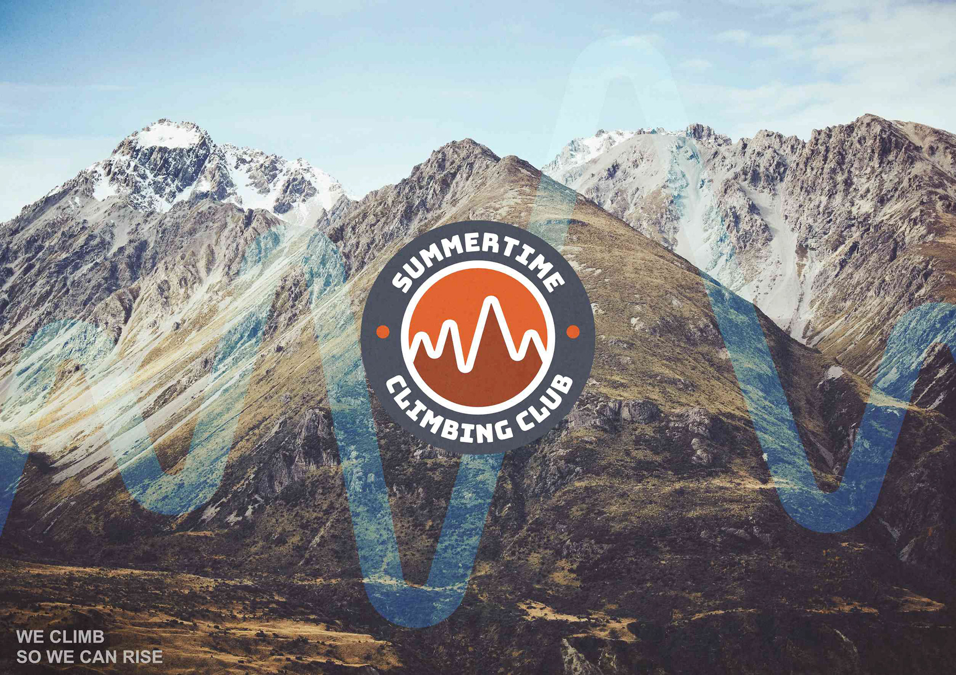
Client: Summertime Climbing Club
Scope: Brand identity, visual system, and brand applications.
In their own words, "climbing is more than a sport, it’s a mindset"
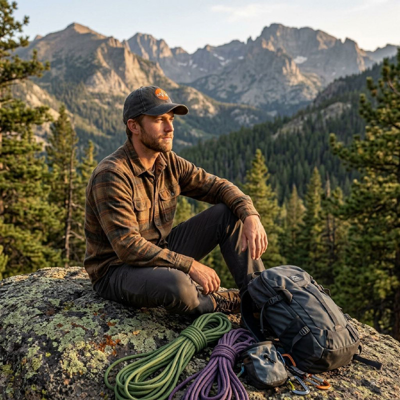
Summertime Climbing Club needed a visual identity that could capture the energy of ascent, the resilience of the climb, and the sense of belonging that comes from doing it together.
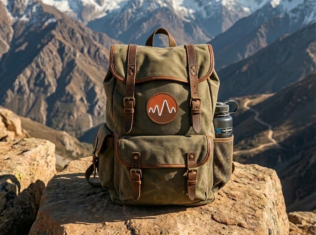
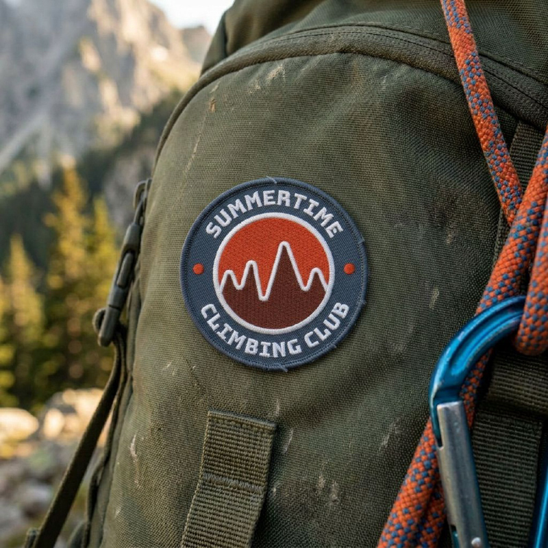
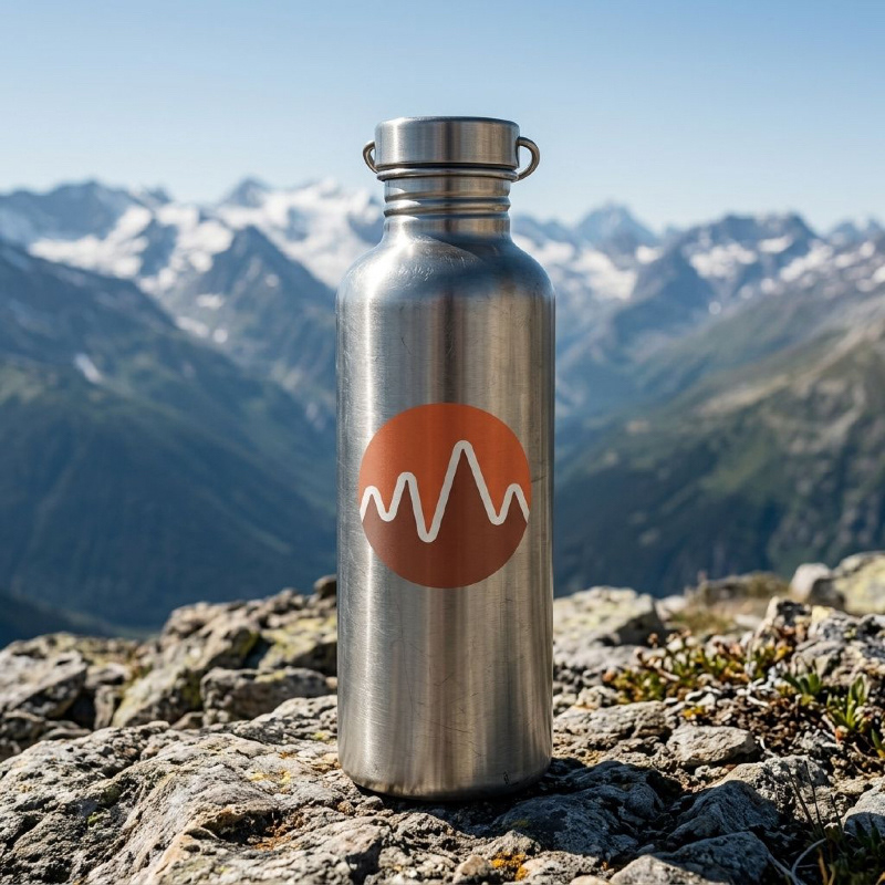
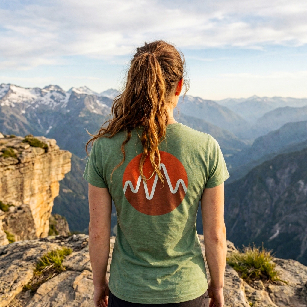
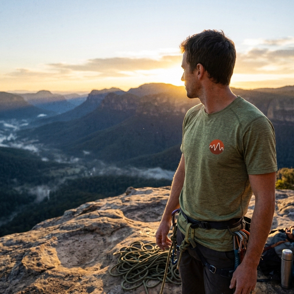
The identity had to work seamlessly across physical gear, environments, and digital platforms; from climbing gyms to trailheads to everyday carry.
The brand is built on three defining traits:
Adventurous:
Driven by challenge and the pursuit of new heights.
Driven by challenge and the pursuit of new heights.
Resilient:
Grounded in endurance, growth, and persistence.
Grounded in endurance, growth, and persistence.
Inclusive:
Open to all skill levels, a shared journey, not a solo pursuit.
Open to all skill levels, a shared journey, not a solo pursuit.
The identity balances boldness with trust, creating something that feels both energising and grounded.
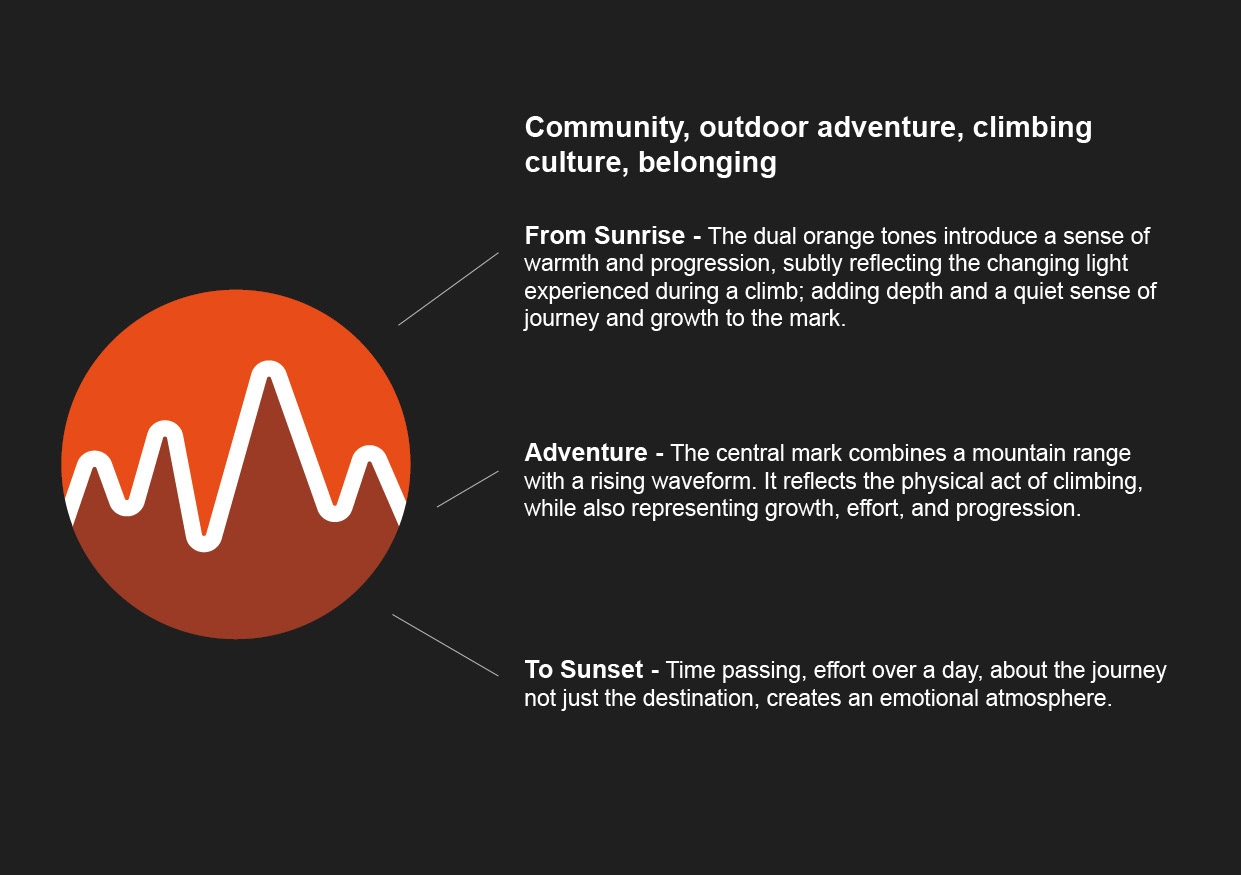
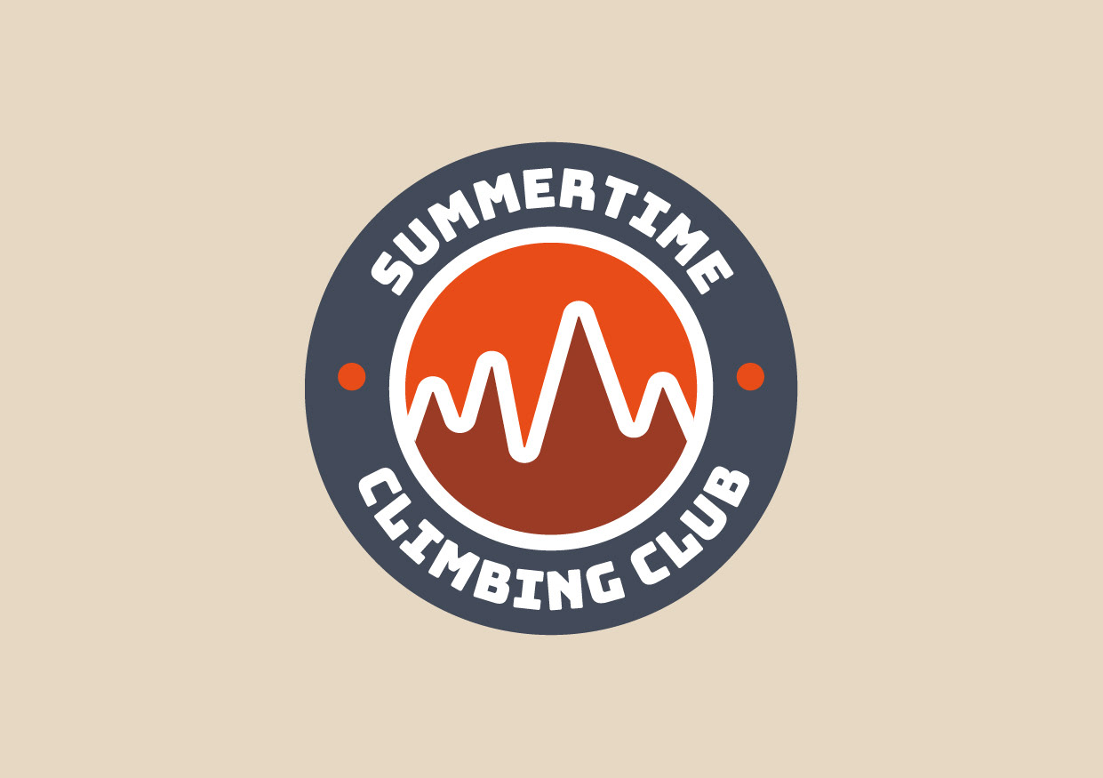
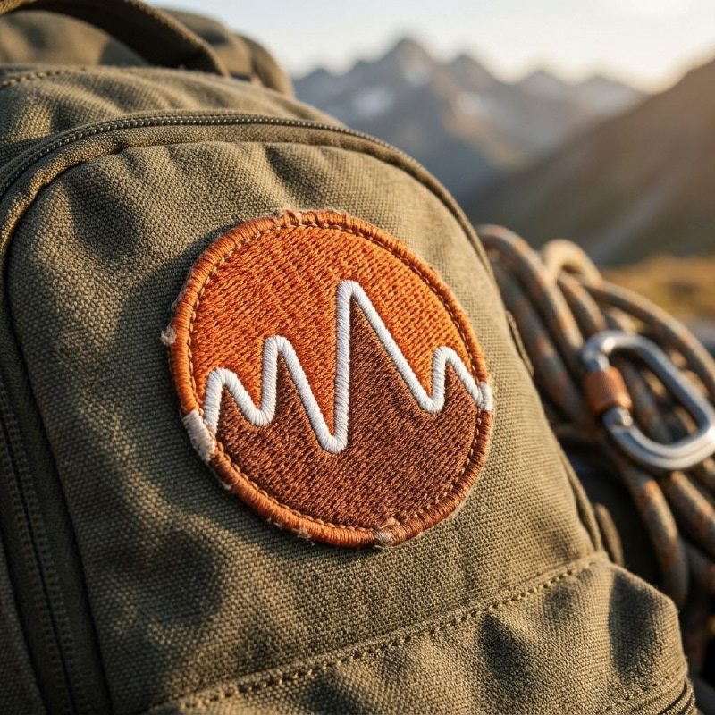
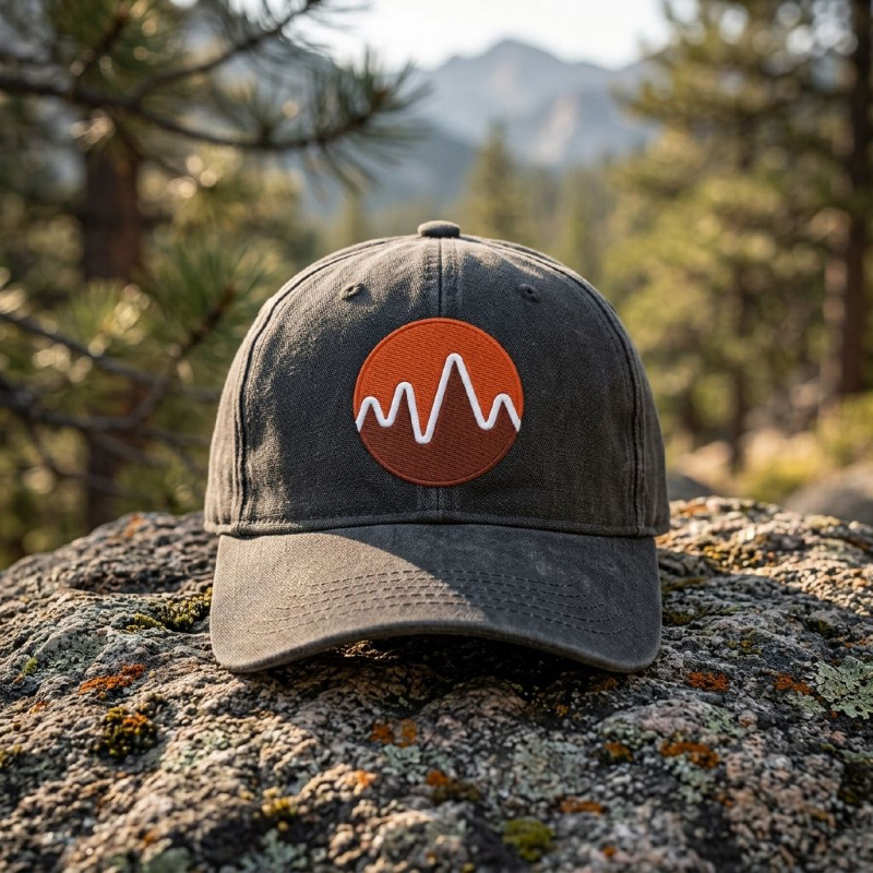
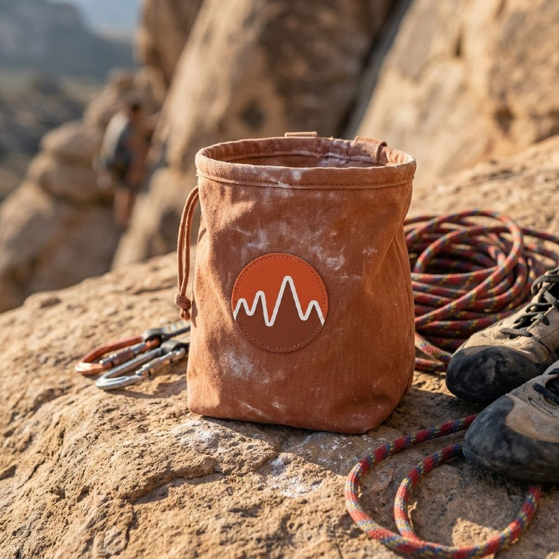
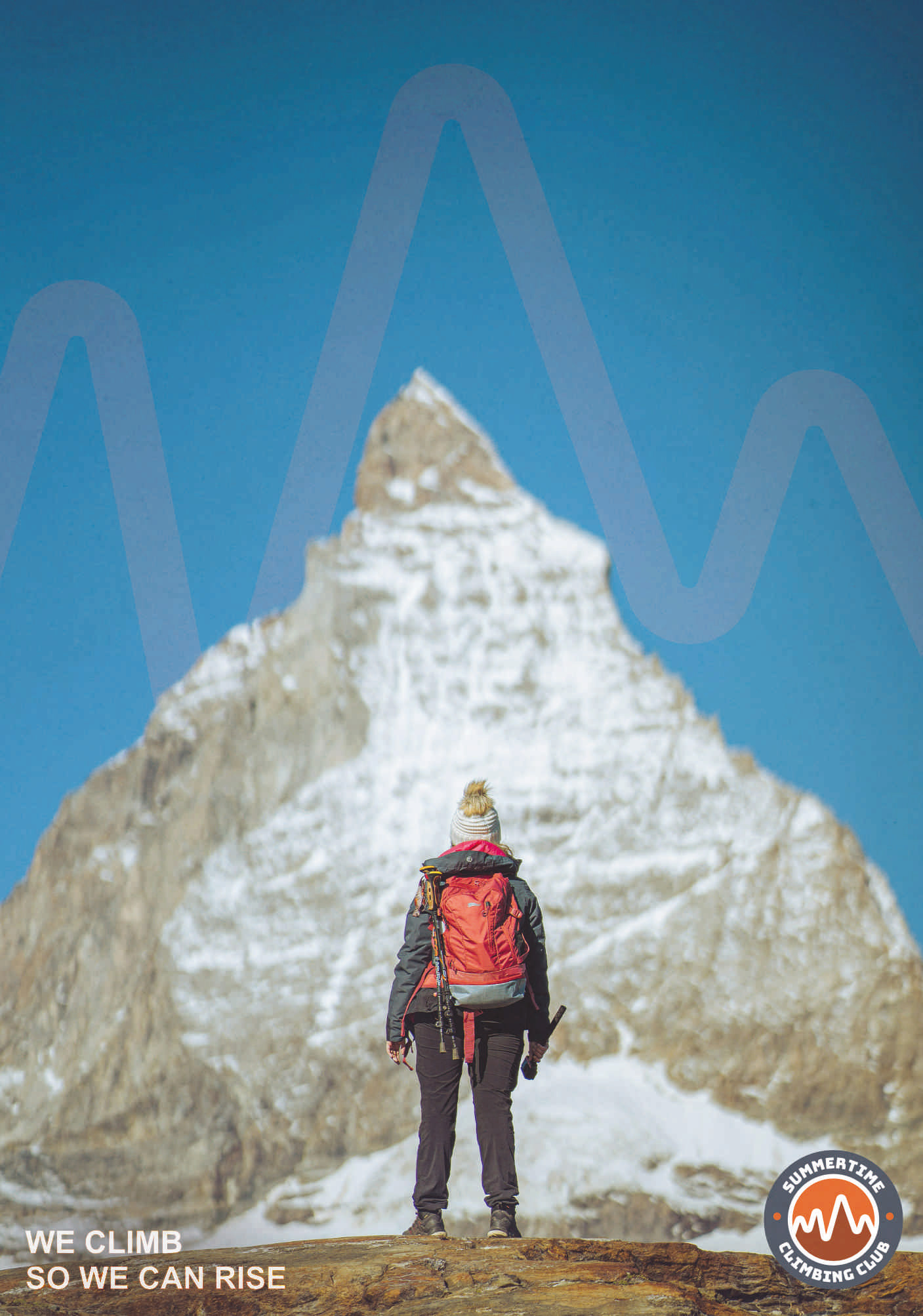
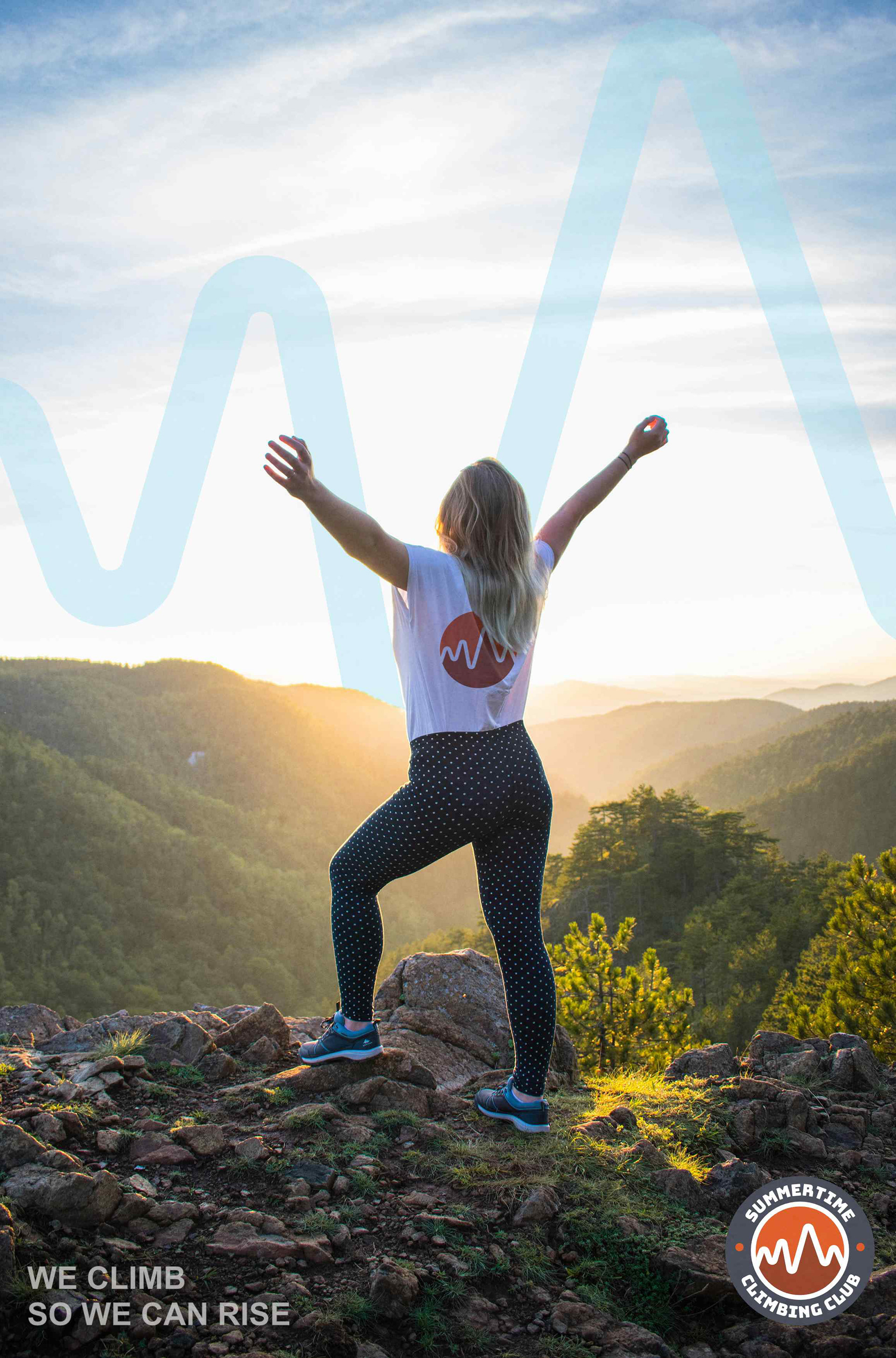
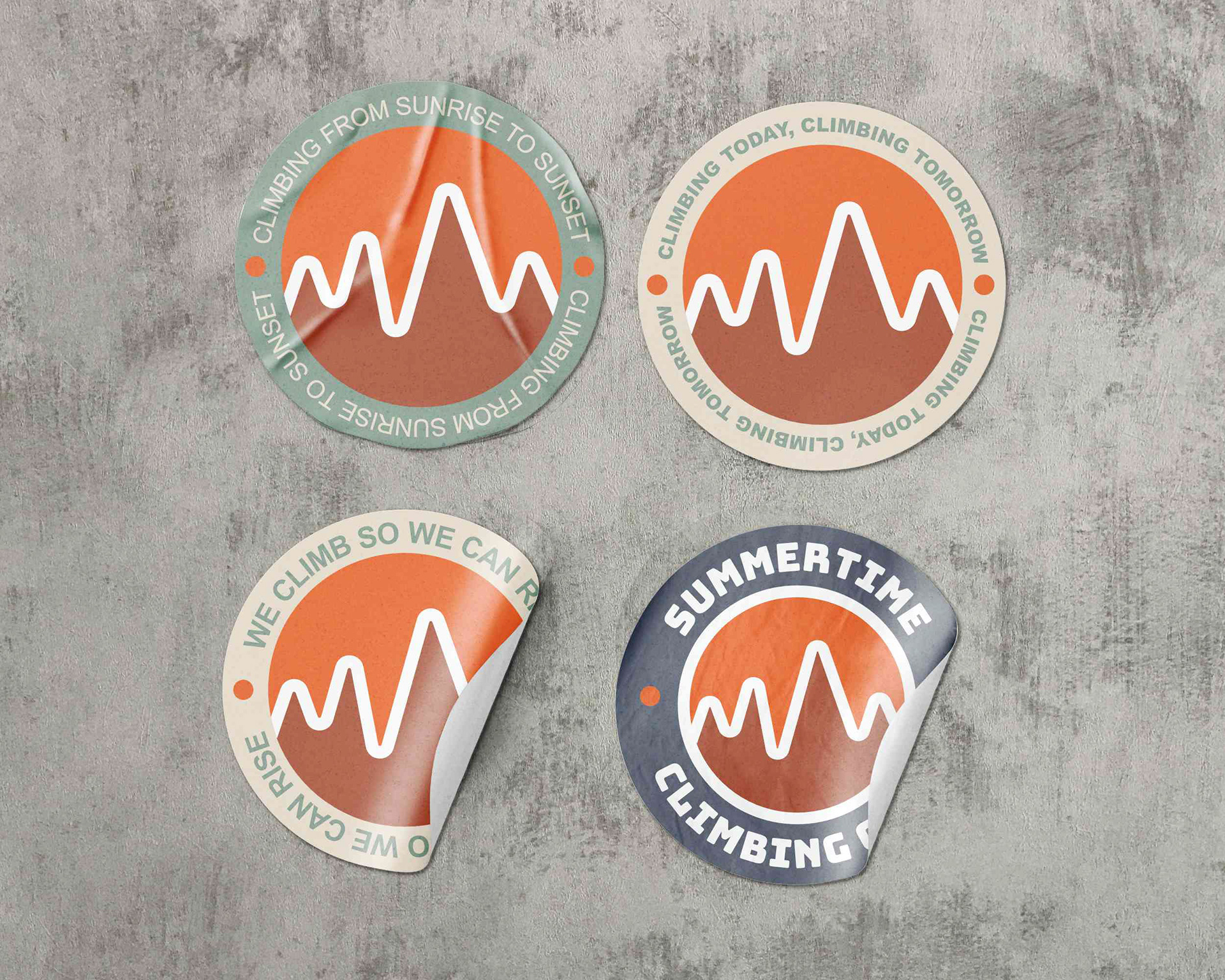
A Symbol of Ascent
The identity centres on a circular emblem, a format rooted in outdoor culture and club heritage.
At its core, a stylised mountain range forms a continuous rising line, referencing both the physical act of climbing and the personal growth that comes with it.
The result is a mark that is simple, recognisable, and built to endure across environments.
Identity: A flexible system designed to scale from detailed badge to simplified icon, ensuring clarity across embroidery, print, and digital use.
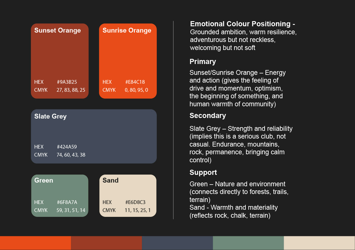
Colour: A warm, sunrise-inspired orange captures energy and momentum.
A deep blue-grey provides contrast, stability, and durability.
A deep blue-grey provides contrast, stability, and durability.
The dual orange tones bring a sense of warmth and progression, inspired by the changing light experienced during a climb, from sunrise to sunset.
The colour system reflects both the intensity and grounding of the climbing experience.
Typography: A bold, all-caps sans-serif reinforces clarity and strength, while maintaining a timeless, functional aesthetic suited to outdoor applications.


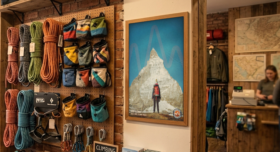
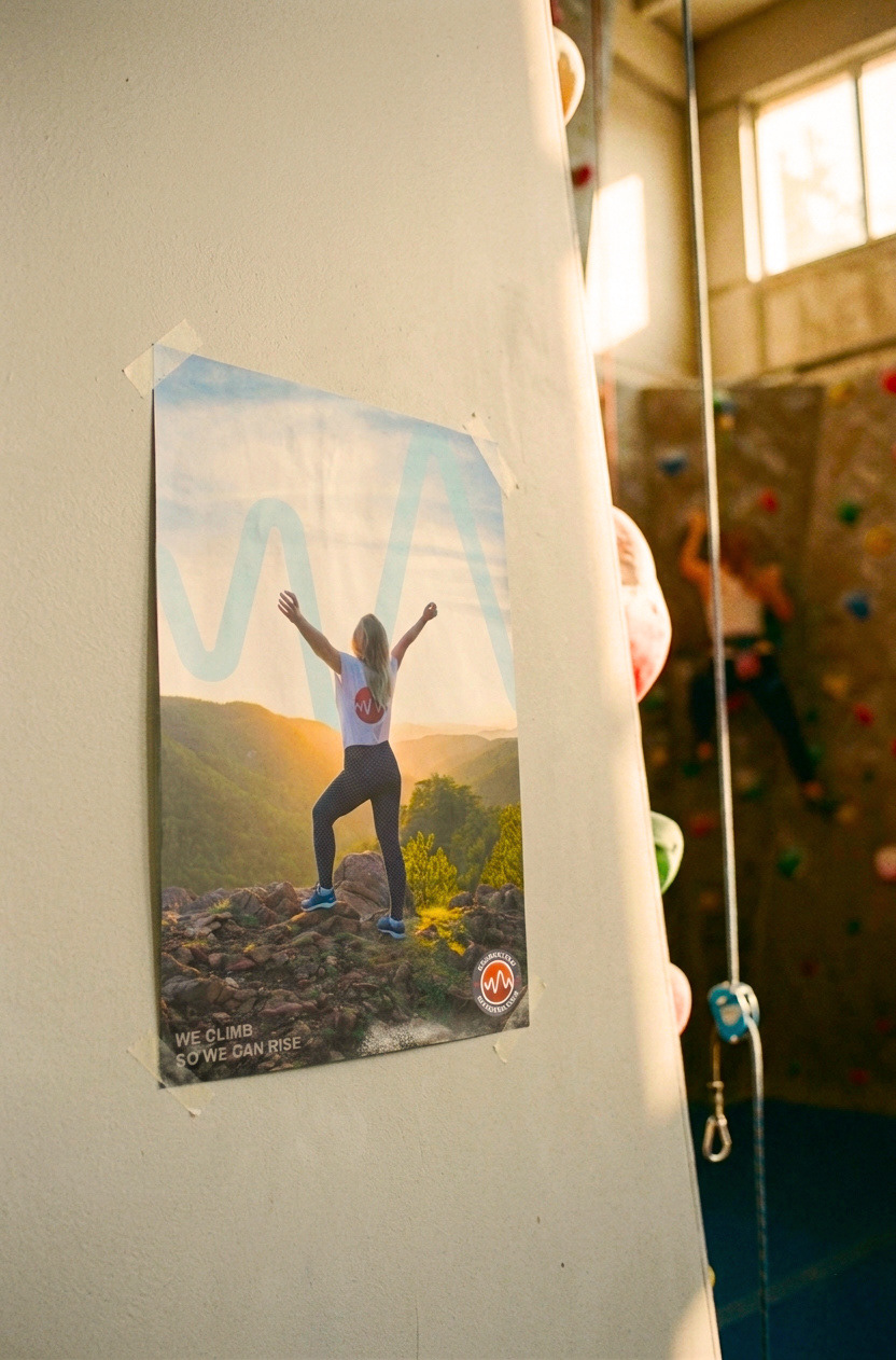
Designed for the Climbing Lifestyle
The identity is built to exist beyond the screen, integrated into the environments where the community lives and climbs.
From gym walls to trailhead boards, and across gear and apparel, the system maintains clarity, impact, and consistency.
Each touchpoint reinforces the same message: a shared pursuit of growth through challenge.
We Climb So We Can Rise
Brand Campaign: A simple, dual-meaning message that captures both physical ascent and personal progression.
It reflects the mindset of the club, where every climb is part of something bigger.
Summertime Climbing Club
A cohesive identity that balances energy with resilience, and individuality with community.
Designed to be worn, used, and experienced, not just seen.
A visual identity that brings climbers together through challenge, growth, and shared experience.