Client: Die Cutting Services
Industry: Industrial manufacturing sector (precision die cutting).
Scope: To create a cohesive and flexible identity system that could be applied consistently across multiple brand touch points.
Project goal: Communicate precision and reliability through a clear, concept-led identity that communicates the company’s core values (precision, reliability, and expertise) while positioning the company as a trusted, forward-looking industrial partner.
At its core, the challenge was simple: how do you visually represent cutting in a way that feels clean, modern, and meaningful, without overcomplicating it?
The identity needed to communicate accuracy and reliability, while also feeling like a business that’s moving forward.
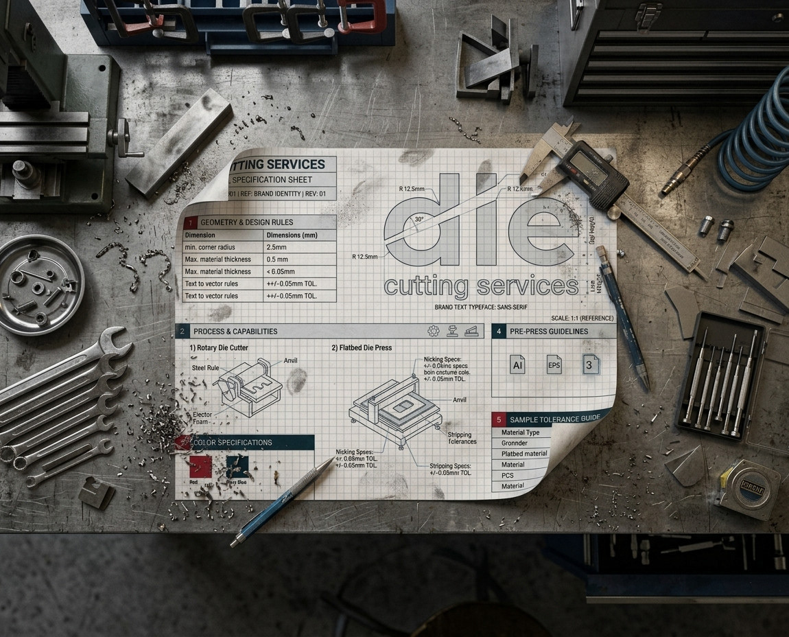
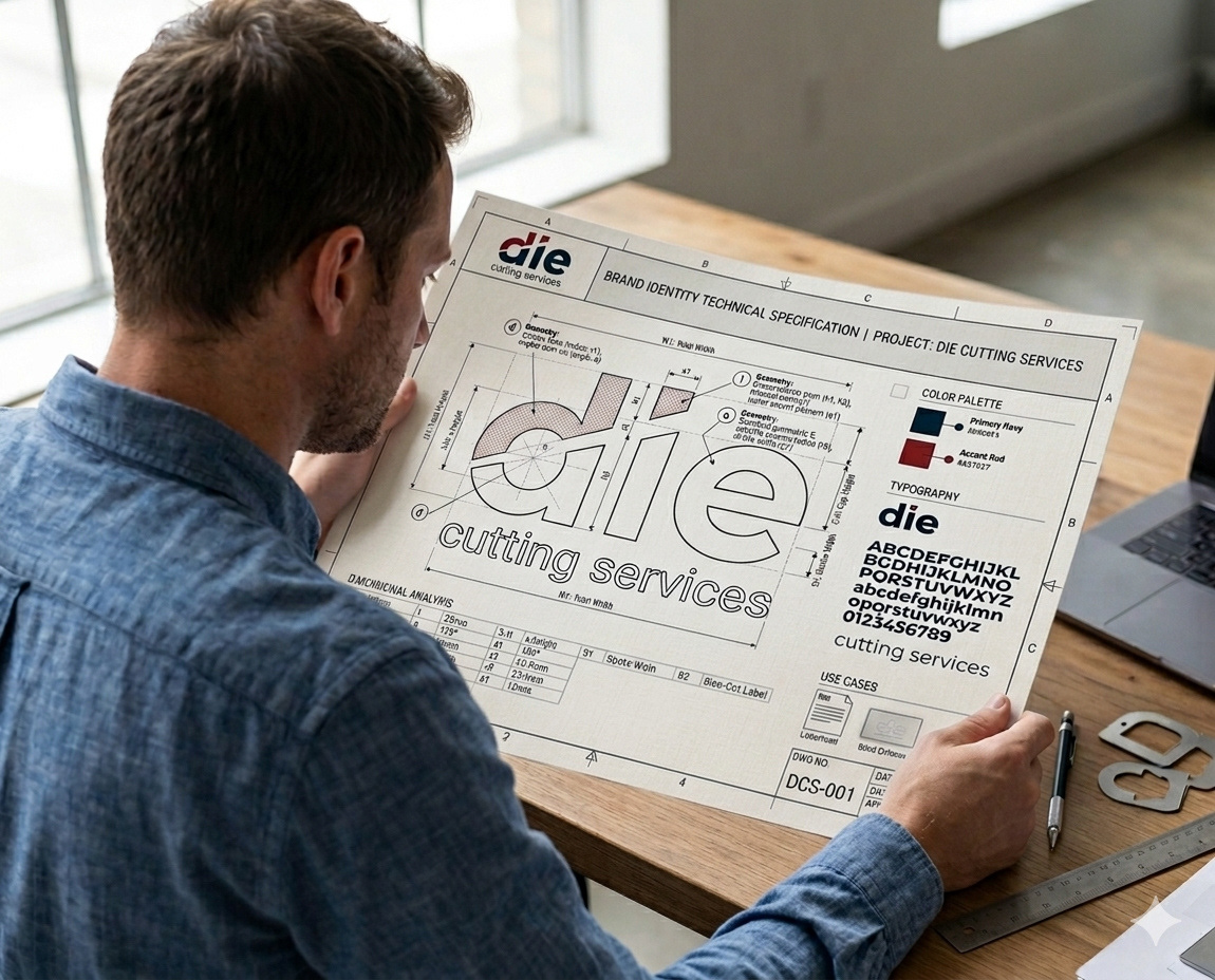
Building the Identity
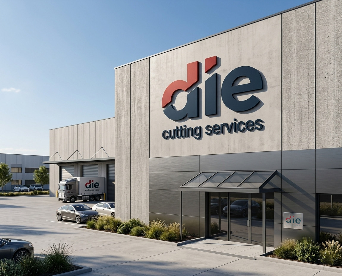
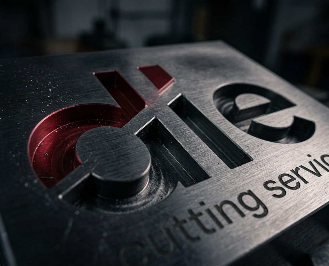
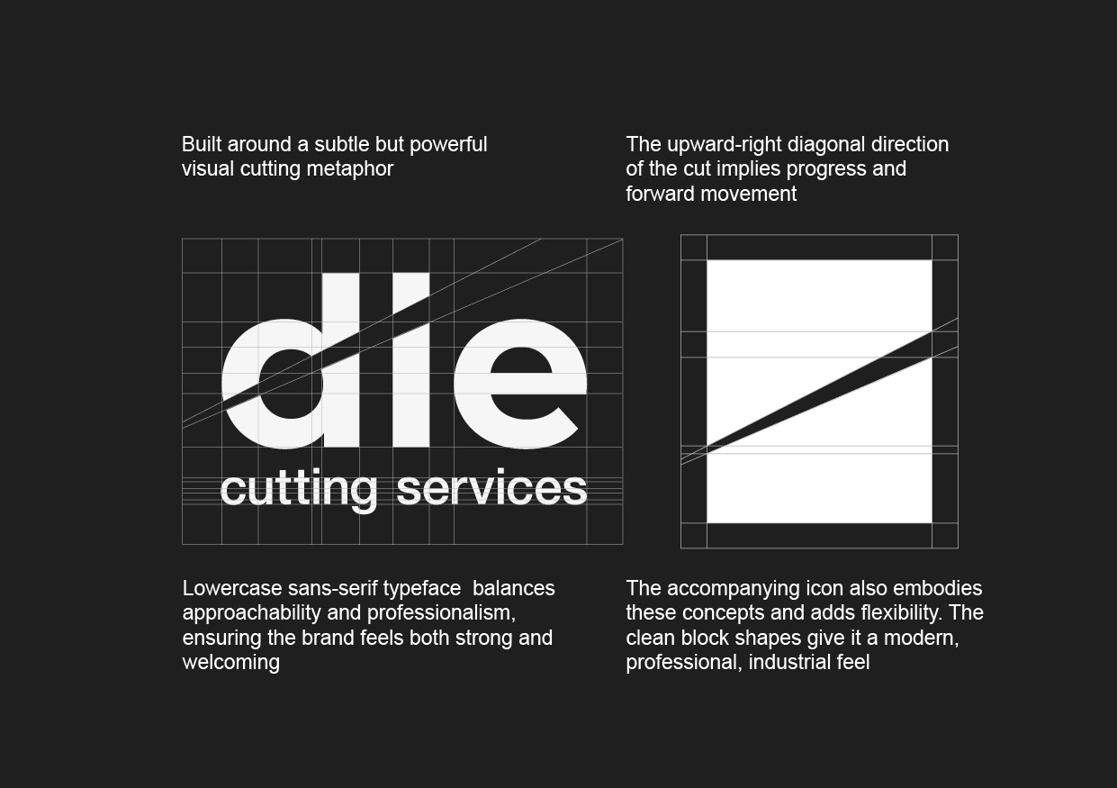
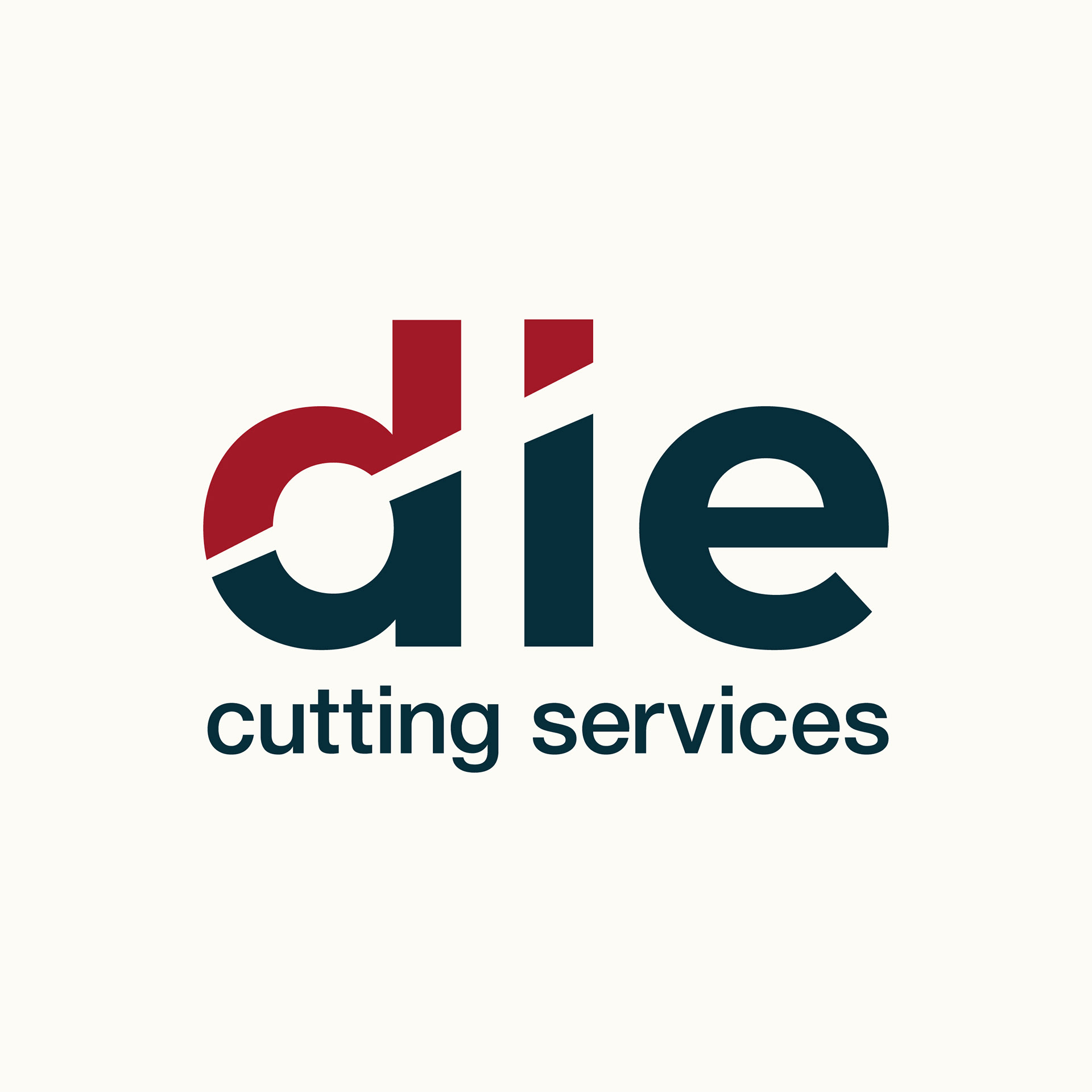
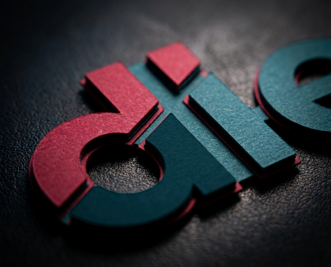
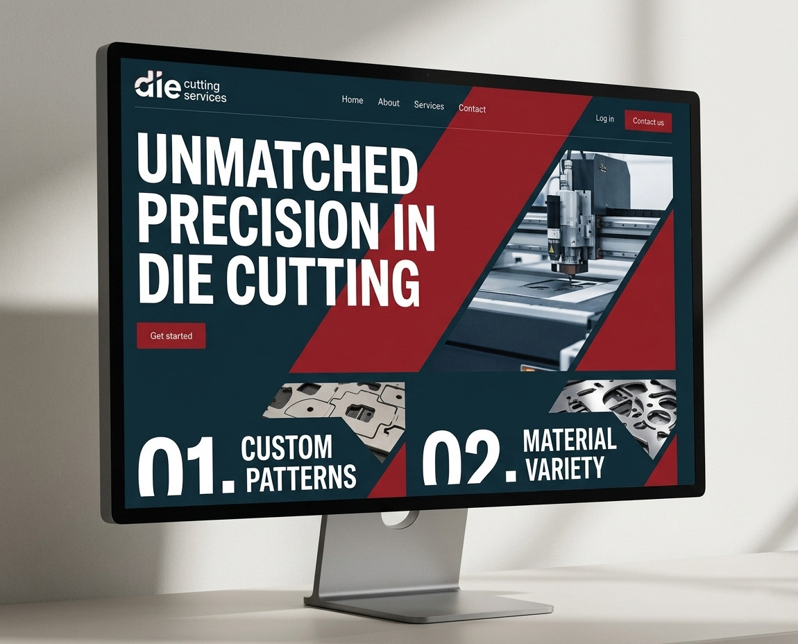
The solution came from leaning into the most fundamental part of the process, the cut itself.
A single diagonal cut runs through the letterforms, directly referencing precision die cutting. It’s subtle, but intentional.
The angle moves upward, introducing a sense of progress and direction.
To reinforce this, the colour is split across the cut. This creates a clear visual separation, echoing the idea of accuracy and control, while also giving the identity a strong, confident presence.
Typography
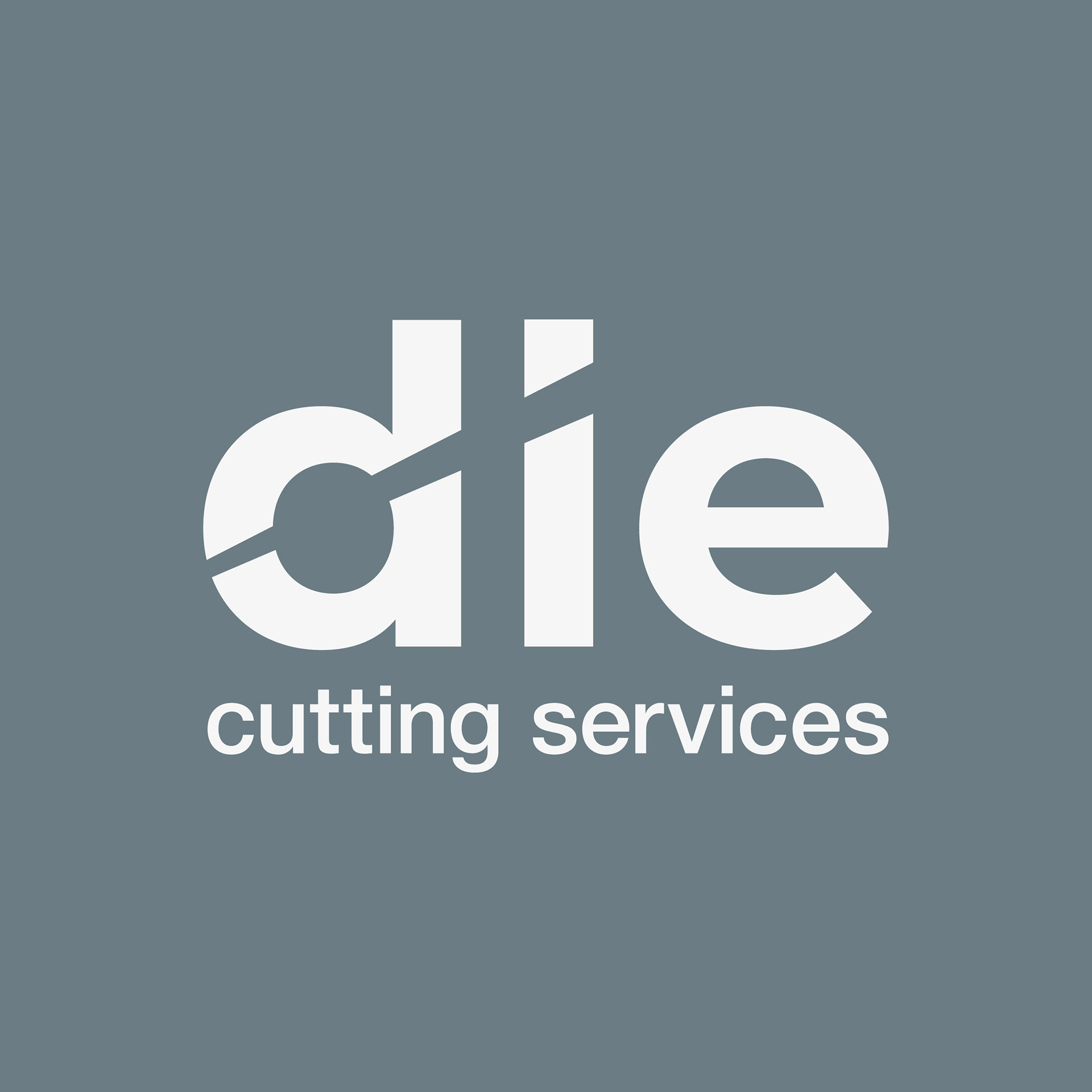
The typography is deliberately simple, a clean, lowercase sans-serif.
This keeps the identity approachable, while still feeling professional and grounded. It doesn’t try to compete with the concept; it's designed to support it.
The strength of the design comes from restraint. Nothing unnecessary, just a clear idea executed with precision.
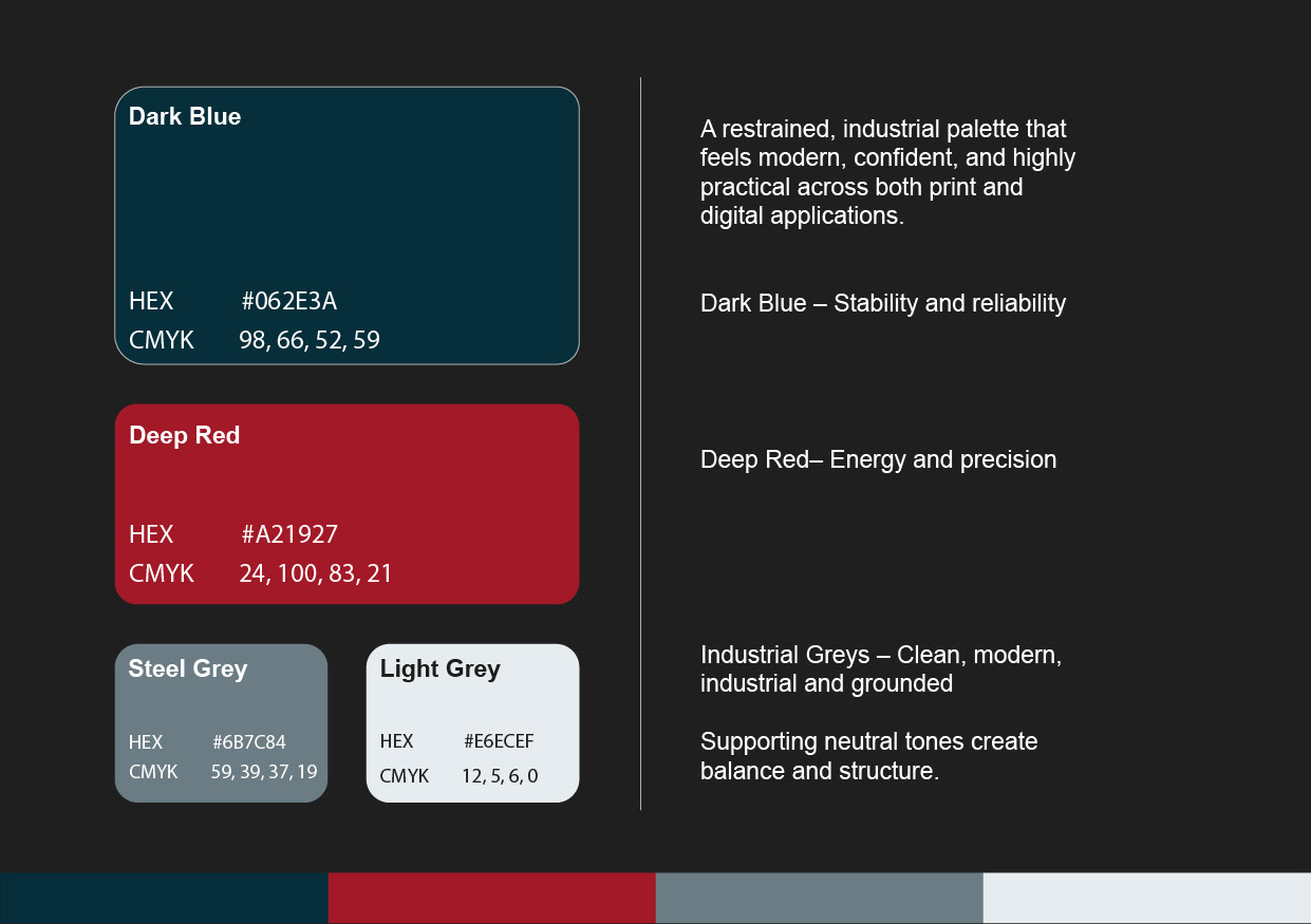
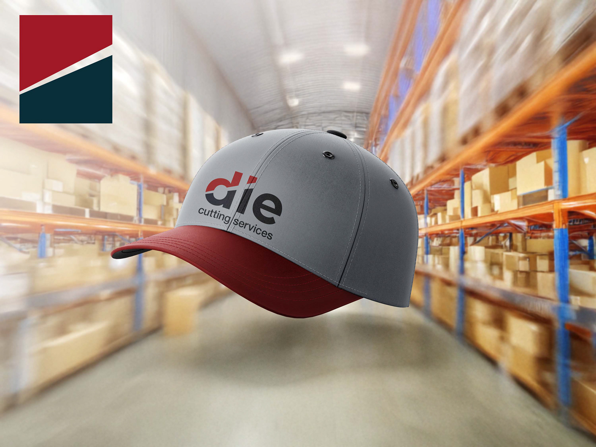
Colour & Tone
The palette is built around contrast and clarity.
A deep blue provides a sense of stability and trust, something you’d expect from a reliable industrial partner. Paired with a bold red, the identity gains energy and sharpness, reinforcing the idea of precision and action.
Together, they create something that feels both strong and purposeful.
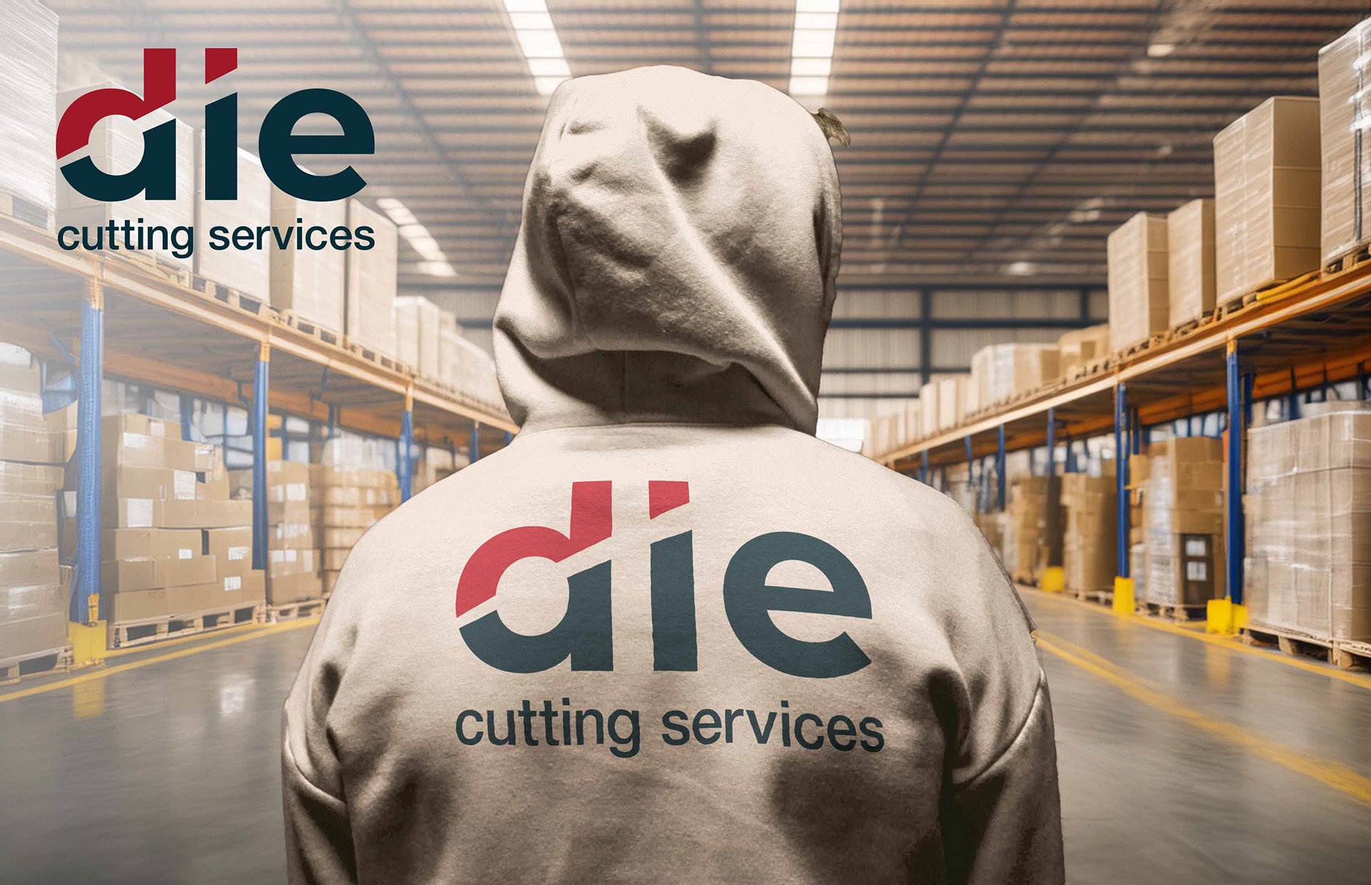
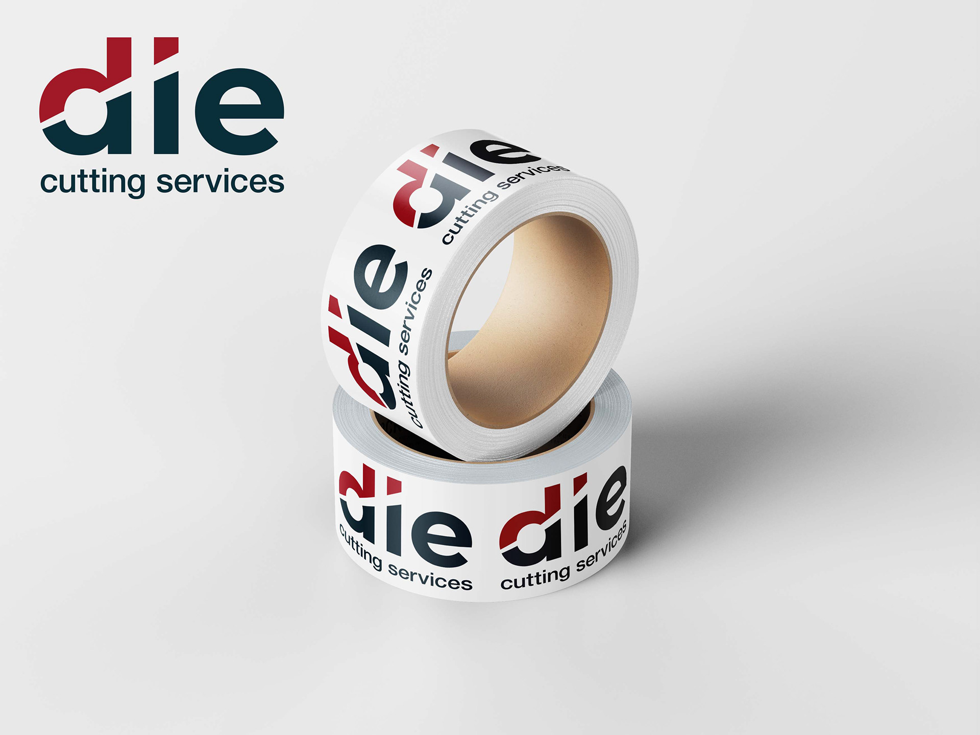
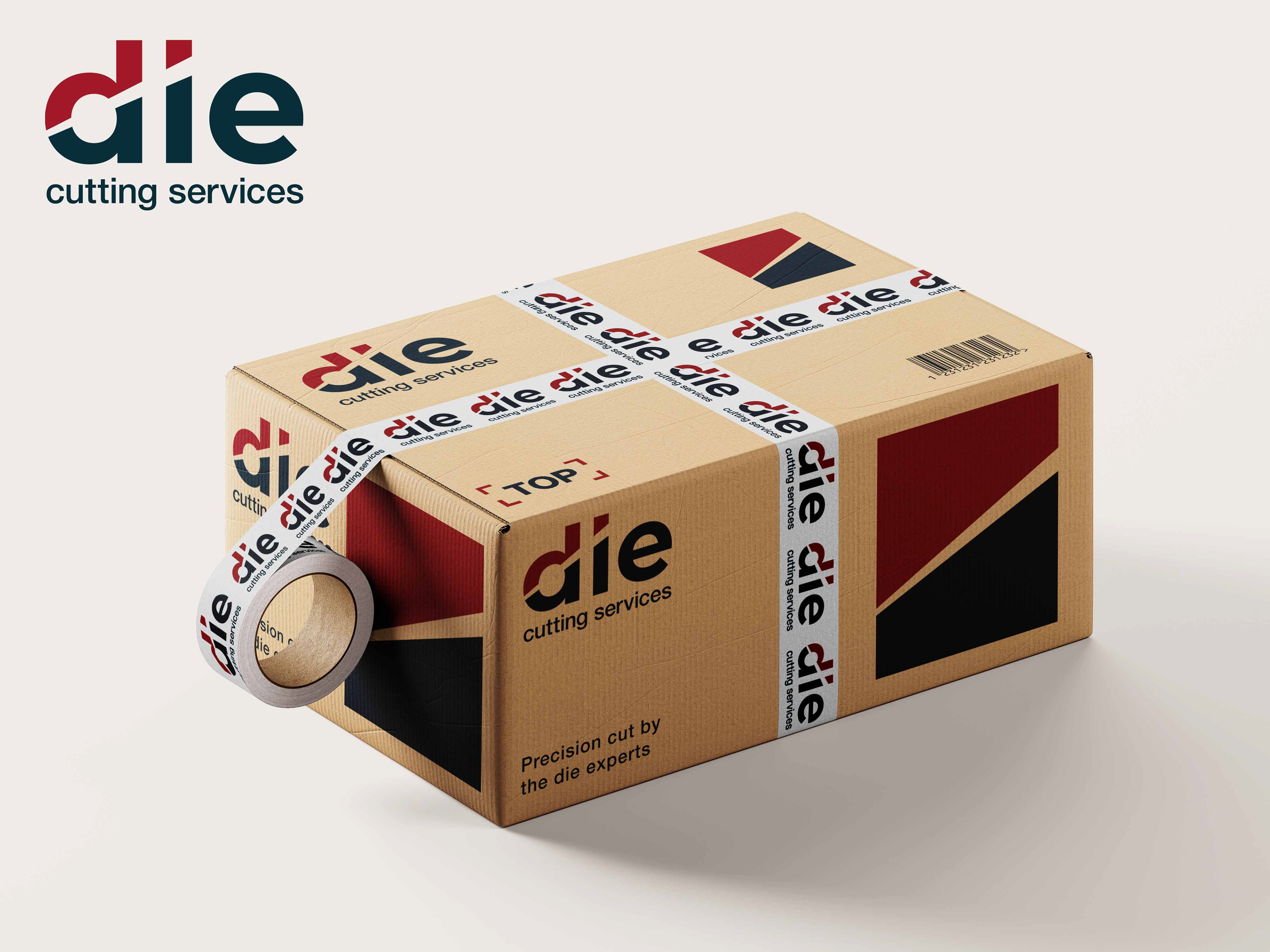
Bringing It to Life
The identity was designed to work in the real world, not just on a screen.
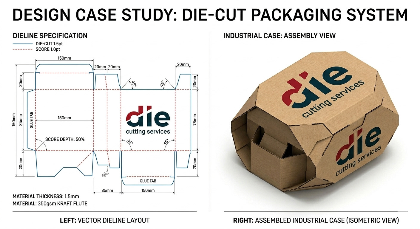
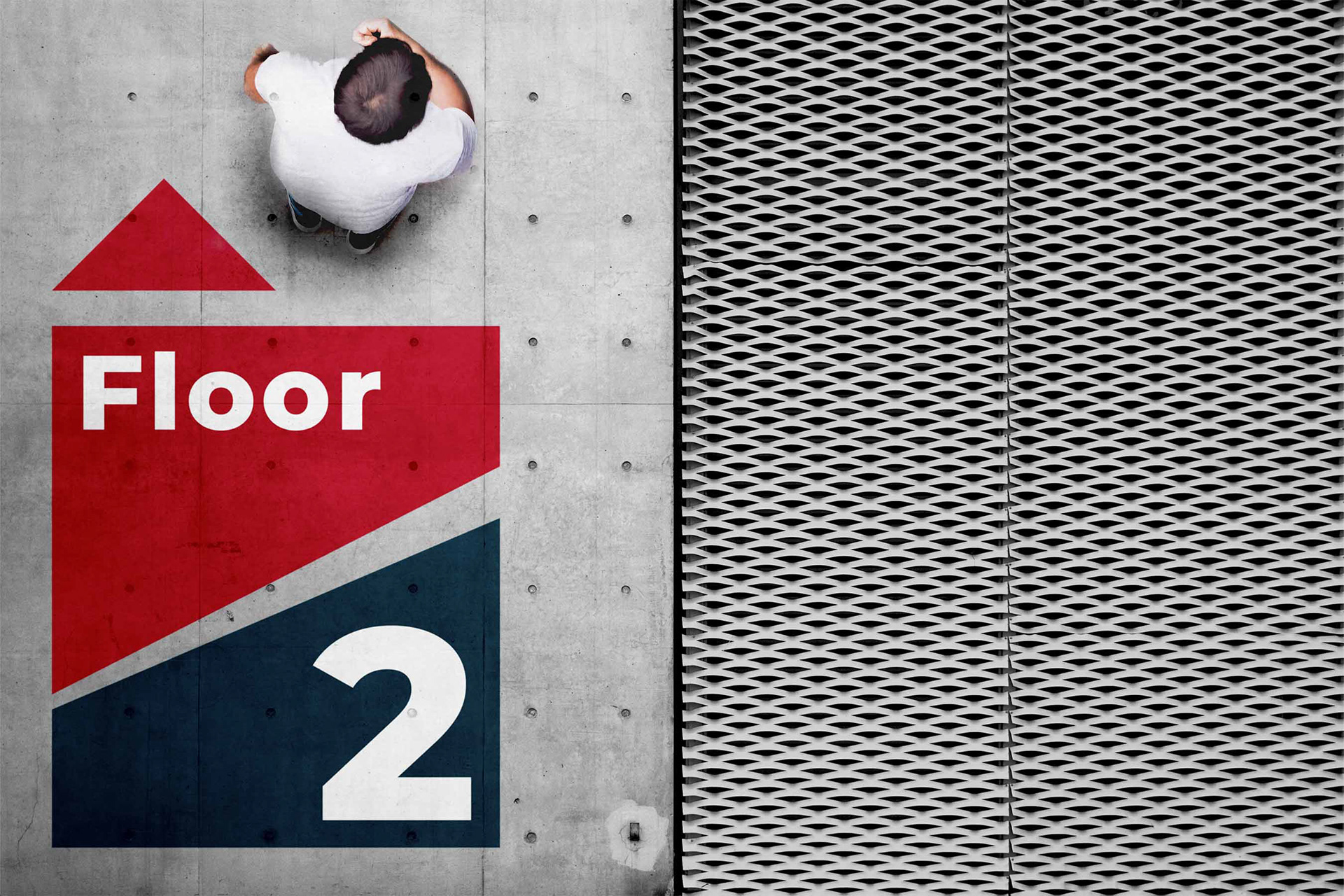
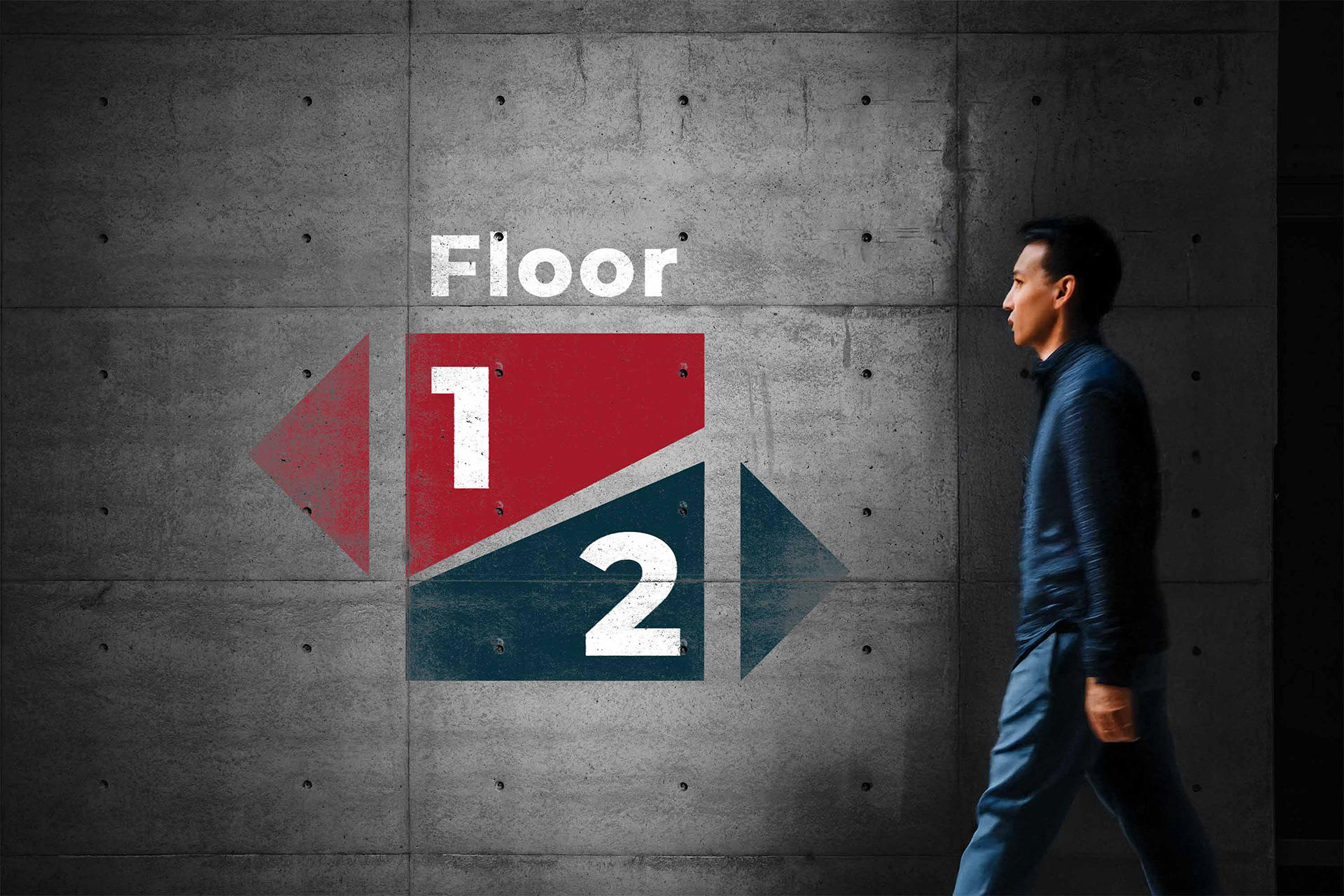
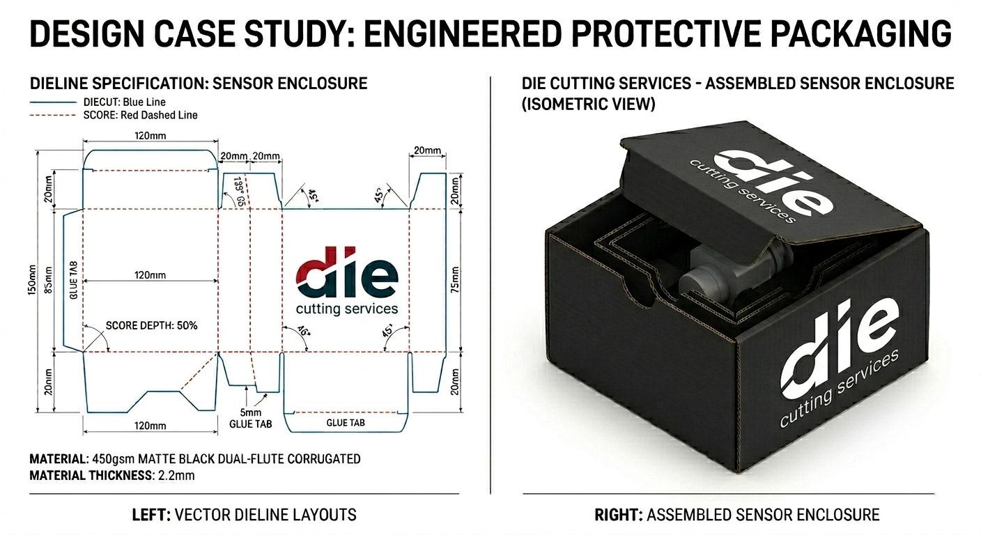
Across printed materials, signage, and digital applications, the system holds together consistently. The cut detail becomes a recognisable thread that ties everything together, without needing to be overused.
It’s flexible, scalable, and built to perform in practical environments.
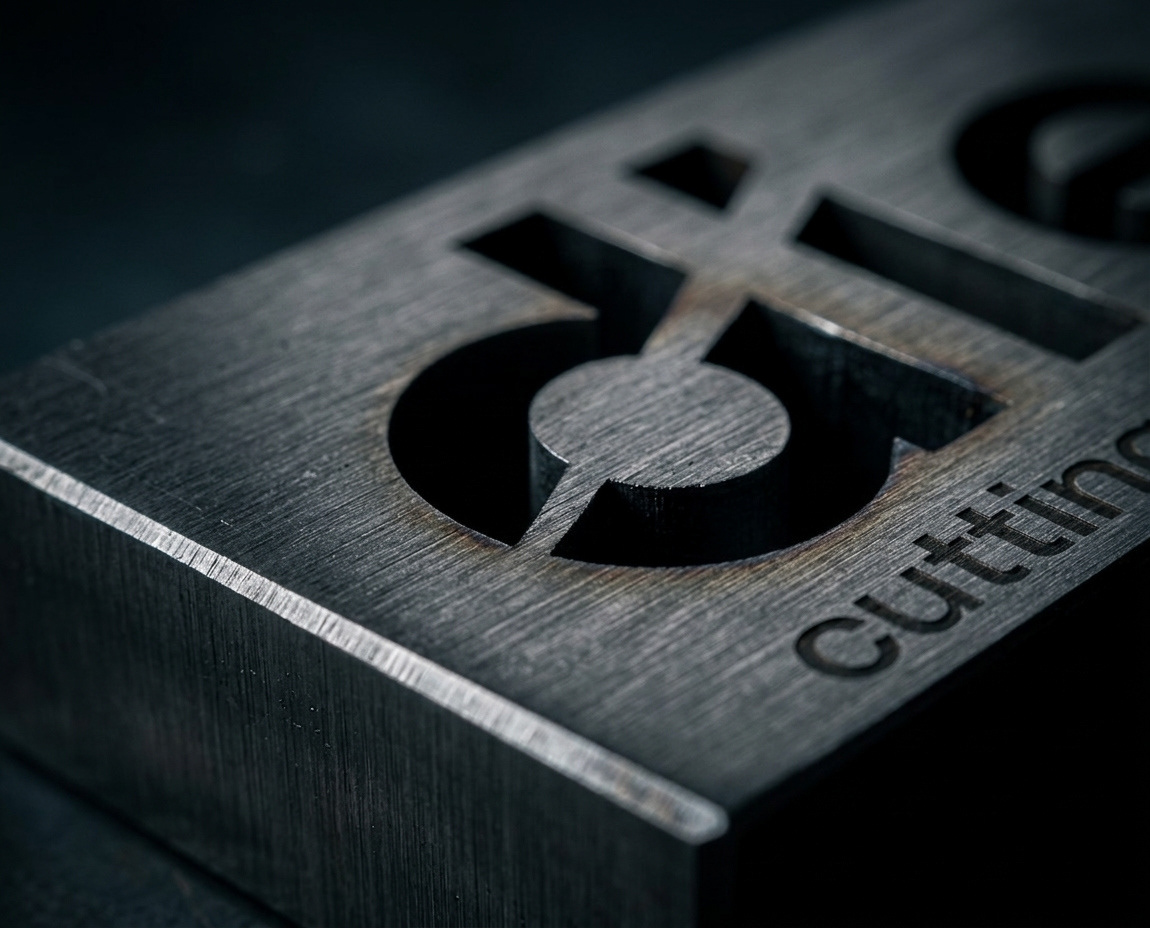
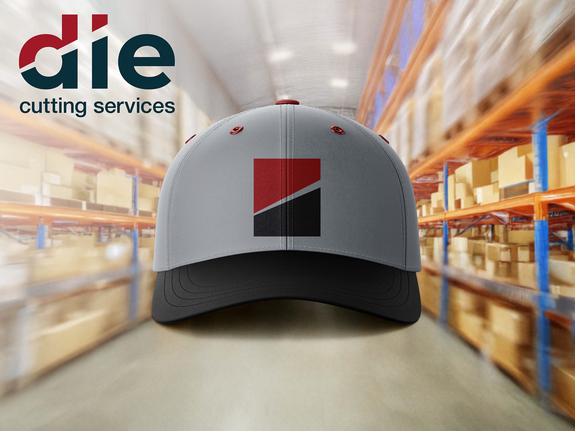
Extending the System
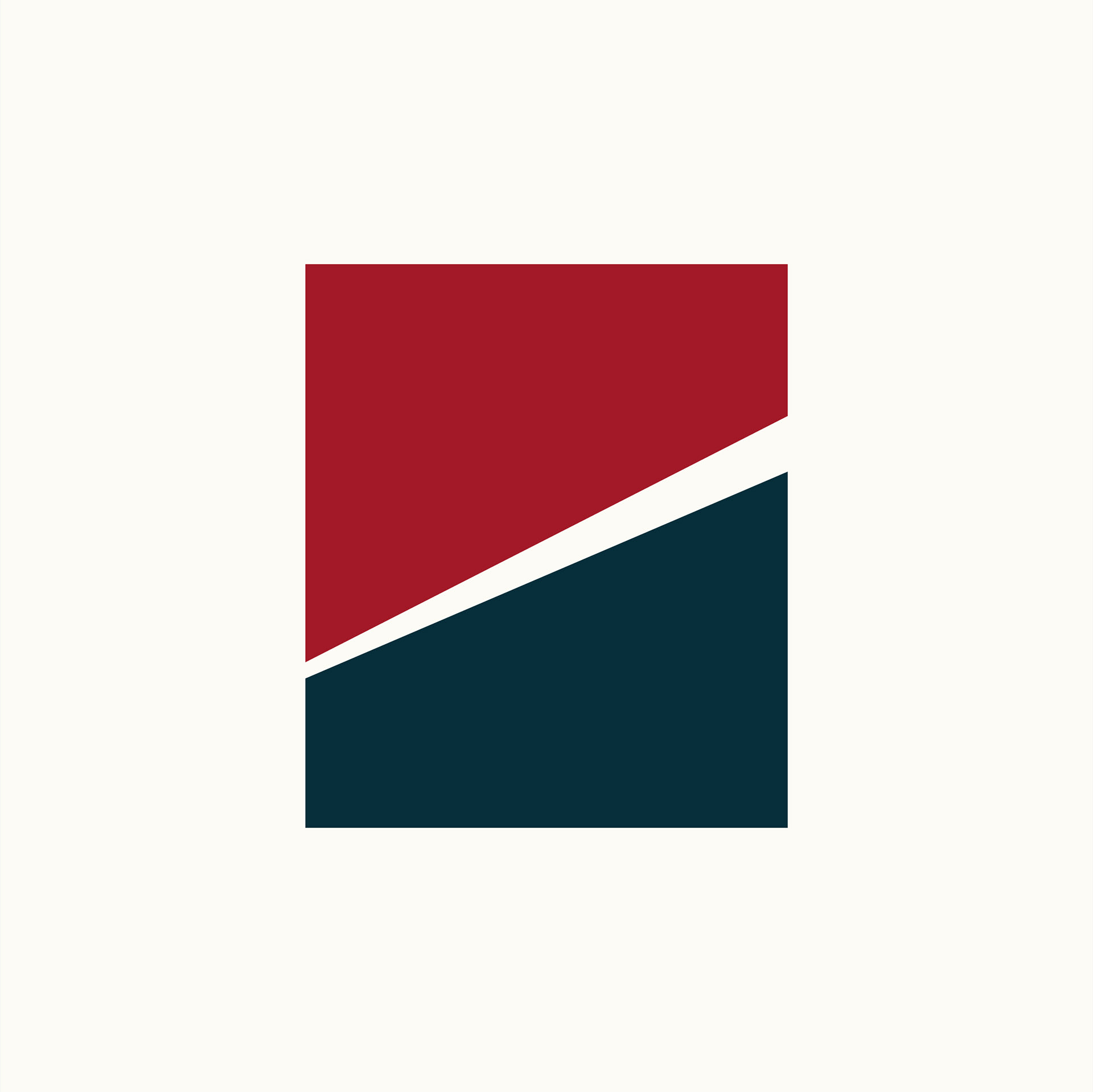
Alongside the logo, a simple geometric icon was developed.
It carries the same visual language — clean, structured, and precise — and allows the brand to function in more compact or standalone situations.
It’s a small addition, but it adds a lot of flexibility.
The Result
The final identity is confident, clear, and built around a single strong idea.
It communicates exactly what Die Cutting Services does, without needing explanation, while positioning them as a modern and reliable partner.
Simple in execution, but purposeful in every detail.